—
4
Min
Read

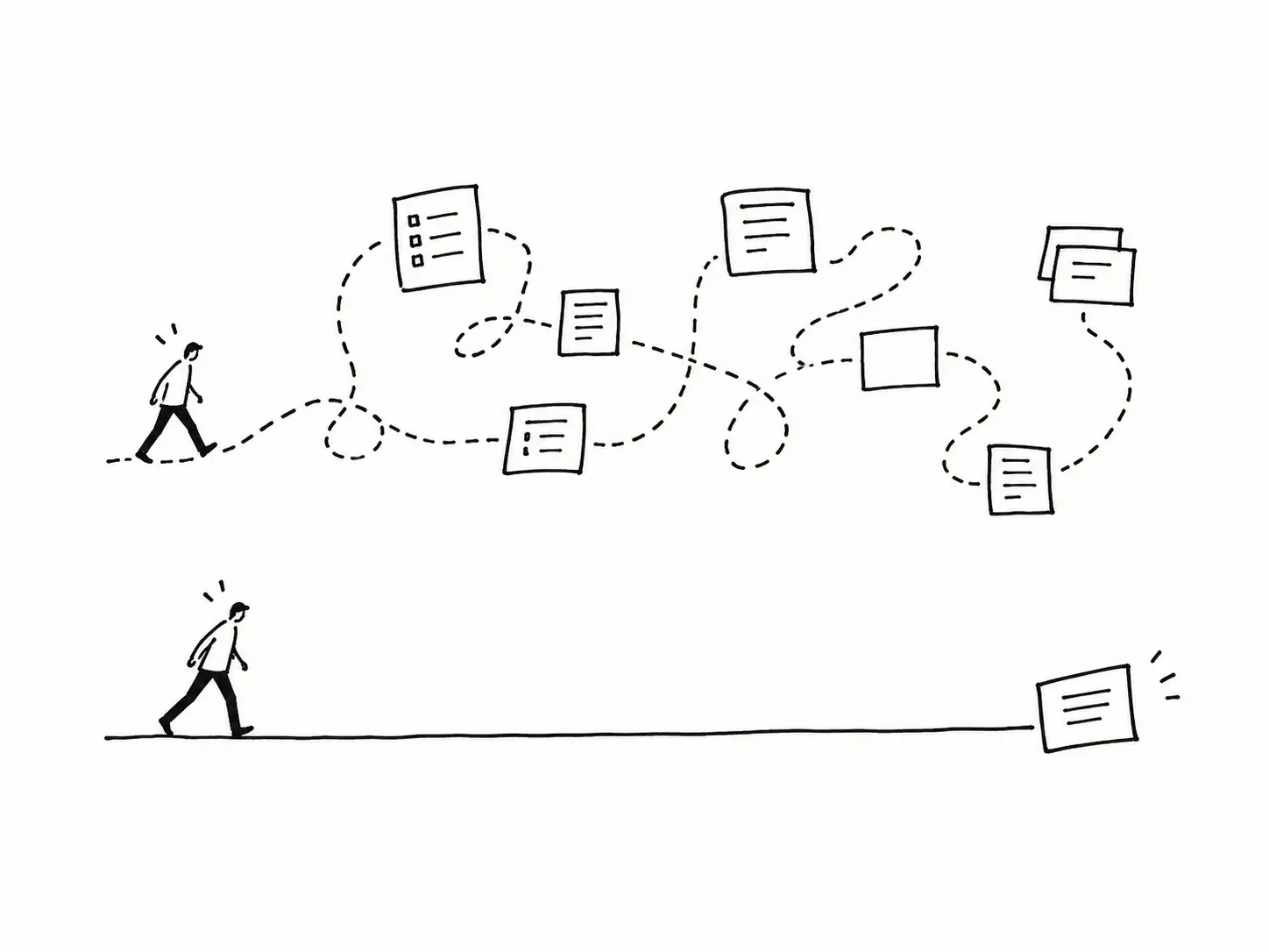
Every SaaS product gets more complex over time. New steps get added one at a time: a field for an edge case, a screen for a sales request, a workaround for the customer who complained loudest. None of those changes looks risky on its own.
This post breaks down why that happens and the concrete steps to bring a workflow back down to one clear path, without cutting the features that make the product valuable.
Key Takeaways
Complex workflows are rarely one bad decision. They're a hundred small ones, stacked.
The complexity usually isn't the features themselves. It's how they were organized.
Map the whole workflow before you touch a single screen.
One primary path beats five equally-weighted options.
A clickable prototype finds friction a flowchart never will, and it sells the redesign faster too.
Test with 2 or 3 people doing the real task, not twenty answering a survey.
Why does a workflow get complicated in the first place?
Almost never on purpose. It happens one small addition at a time, and each one looks reasonable in isolation.
I saw this clearly on a grant review platform. Reviewers had to check an applicant's documents against a set of requirements before approving them, basically acting as a human gate before funding moved forward. But every action lived in its own window or tab: one place to see the application, another to pull up past documents, another to leave a note. None of those screens were wrong on their own. Together, they made a simple decision feel like a scavenger hunt.
The real issue wasn't a missing feature. It was the lack of design direction. Features had been added over time with no one stepping back to organize them around the task the reviewer was actually doing.
Ask yourself:
When did we last look at this flow start to finish, instead of screen by screen?
How many of these steps exist because of a one-off request, not the core task?
Are we organizing around how the backend stores data, or how the person actually works?
Complexity rarely arrives all at once. It accumulates.
How do you map a workflow before redesigning it?
Lay out every step end to end before you change anything. On the grant platform, that meant tracing the full path a reviewer took to approve or reject an applicant, not just the screens, but every tab switch, every place they had to go looking for a document that should have been in front of them already.
Use:
One page mapping every step, not a polished diagram
Color-coding for the core path versus edge cases
Time spent per step, so you know where people actually get stuck
A walk-through with the people doing the work, not just stakeholders
What's the fastest way to cut a workflow down?
Find the one path most people actually take, and design for that first. For the reviewers, that path was: see the application, check it against requirements, confirm or flag it. Everything else, notes, history, edge-case handling, could exist, but it didn't need to sit in the way of that core loop.
Instead:
Instead of separate tabs for related information, surface what's needed right on the main screen
Instead of showing every field, show only what this step needs
Instead of designing for the exception, design for the pattern and handle exceptions separately
Not five paths. Not ten. One.
Familiar patterns do more work than clever ones
This is the part I'd push back on other designers about: it's not the features that make a product feel complicated. It's how unintuitively they're organized. On the grant platform, most of the fix wasn't new functionality. It was navigation and hierarchy built around patterns people already know from other digital products, so nobody had to learn a new mental model just to approve an application.
One addition did help beyond reorganizing: a simple question-and-answer option, similar to how a search engine's AI answer works. A reviewer could ask whether an applicant meets a requirement, get a direct answer, and see a link to the exact document it came from if they wanted to verify it themselves. Same idea as getting an answer up top with the source underneath in case you want to dig deeper.
Add:
Navigation and layout patterns borrowed from tools people already use daily
A direct-answer option with a link back to the source, for verification, not blind trust
Defaults that surface the most-needed information without a click
Why a clickable prototype sold the redesign faster than any deck could
A diagram shows the plan. A prototype shows what actually happens when someone tries to use it.
The team had tried to fix this navigation problem once before, and the result was bad enough that reviewers kept going back to a legacy tool instead. That history made the next proposal a hard sell on slides alone. What changed it was a working prototype. I shared a demo link, walked the lead through it live, and fixed small issues in the same meeting. Updates went out the same day. Seeing it and clicking through it did what a wireframe deck couldn't: it proved the new version actually worked before anyone committed engineering time to it.
Approximate results after the redesign: onboarding time for new reviewers dropped by roughly 40%, and the number of clicks to approve an application fell by around 50%, mostly from removing tab-switching and surfacing information that used to require a separate search.
A flowchart tells you the plan. A prototype tells you the truth, and it convinces people faster than a meeting ever will.
How many users do you need to test a simplified workflow?
Two or three people doing the real task tells you more than fifty answering a survey.
Ask yourself:
Where did they pause when they shouldn't have?
What did they try that the design didn't expect?
Did they finish the task without asking what to do next?
Before vs. after simplifying the workflow
Aspect | Complex workflow | Simplified workflow |
|---|---|---|
Where information lived | Spread across separate tabs and windows | Surfaced on the main screen |
Steps to approve an application | Multiple tab switches per review | One continuous path |
Onboarding new reviewers | Slow enough that people reverted to a legacy tool | ~40% faster, approximately |
Clicks to complete a review | High, from tab-switching | ~50% fewer, approximately |
How the redesign got approved | A slide deck proposal | A clickable prototype, tested and fixed live |
Final thoughts
A simpler workflow doesn't do less. It just asks less of the person using it before they reach the part that matters. On the grant platform, nothing about the reviewer's job changed. What changed was how much digging they had to do to make a decision they already knew how to make.
The business outcomes followed from that:
Faster onboarding
Fewer support questions
A proposal that sold itself the moment someone could click through it instead of just look at it
If a workflow in your product has gotten harder to use than it should be, I'll review it and prototype a simpler version you can test with real users before any engineering time goes into it. Get a Product Review
