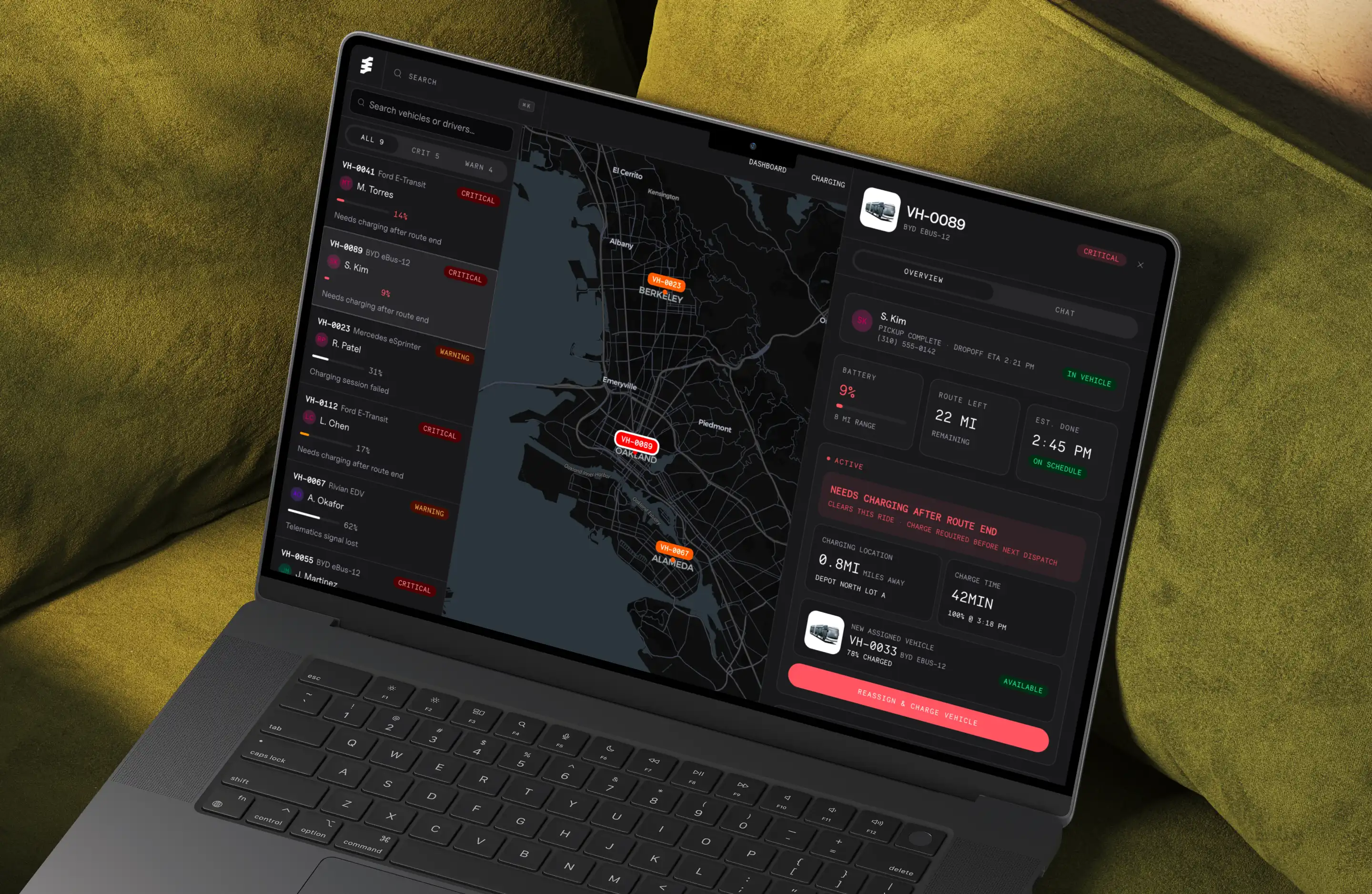
The data models we built to handle accounting for 25k+ investment vehicles
—
2
Min
Read

Designing a SaaS product efficiently isn’t about moving fast blindly, it’s about eliminating waste. Real speed comes from clarity, validating the critical workflow early, cutting anything that doesn’t serve it, and only polishing once the core experience actually works.
Key Takeaways
Efficiency isn’t about speed, it’s about reducing waste in design and development.
Start by writing a clear 1–2 sentence problem statement.
Identify the critical path, the minimum workflow required for users to get value.
Sketch flows fast and ugly before thinking about UI or visuals.
Build low-fidelity prototypes first; avoid polishing until the flow is proven.
Validate early with 3–5 real users and observe friction, confusion, or hesitations.
Cut anything that doesn’t support the critical path, less scope = faster to ship.
Add branding/UI/motion only after the flow works.
Launch fast, measure behavior, and iterate based on real usage, not assumptions.
Before jumping into the process, let’s set the foundation. Designing SaaS efficiently means focusing on the core workflow first, validating early, and avoiding unnecessary UI work until real users prove the experience works. The framework below is the approach I use when helping founders turn ideas into functional products.Start with the core problem your product solves.
A SaaS app exists to remove friction from a specific workflow. Write a 1–2 sentence problem statement. If you can’t articulate the problem clearly, your product will feel scattered.
With that foundation in place, here’s how to design a SaaS product efficiently:
1) Define the “critical path”, the one workflow users must complete.
Every successful SaaS tool has a primary job-to-be-done. List the 3–7 steps a user must take to get value from your product. This becomes your design blueprint.
2) Sketch fast, ugly, and without polish.
Use paper or a whiteboard.
Your goal: map the flow, not design screens.
Good SaaS design starts with logic, not layout.
3) Build a low-fidelity prototype (no UI yet).
Use Figma or Framer to create clickable wireframes.
Avoid color, branding, grids, and spacing systems.
Efficiency = validating the experience before you waste time polishing it.
3) Validate with 3–5 real users immediately.
Talk to actual users in your target industry — not friends, not relatives.
Watch them complete the critical path.
Any hesitation, confusion, or question is an actionable signal.
4) Simplify aggressively.
Most early SaaS products try to offer too much.
Cut features that don’t support the critical path.
A smaller, clearer app is faster to build and easier to use.
5) Add UI, brand, and interaction polish only after the flow works.
This is when you introduce typography, spacing, iconography, component systems, motion, etc.
Doing this too early is the #1 source of wasted time in SaaS design.
6) Ship fast, measure real usage, and iterate.
Efficiency doesn’t end at launch.
Instrument key actions, look for drop-offs, and improve the workflow based on evidence — not opinions.
Conclusion
Great SaaS products aren’t born from perfect screens, they’re born from a smooth path to value. Solve one critical workflow well, strip away noise, then polish with intention. When you respect that order, everything else becomes easier: less rework, cleaner handoffs, faster validation, and a product people actually use.
Take a moment and ask yourself: what part of your current design process is slowing down clarity? Apply this framework on the next iteration and you’ll move faster not because you rushed, but because you reduced waste.