Most products don’t feel broken because of a single bad decision. They feel broken because small inconsistencies quietly accumulate over time. Spacing, behavior, copy, and visual rules drift just enough that the product becomes harder to predict. Individually, none of these issues seem serious. Together, they erode trust and make the product feel unreliable.

Key Takeaways
Products rarely feel broken because of one bad decision, they drift as many small inconsistencies accumulate over time
Inconsistency is cheap early on, which is why teams ignore it until it becomes hard to unwind
Drift isn’t caused by carelessness, it’s caused by local optimization without shared structure
Users feel inconsistency as hesitation, relearning, and loss of trust, even when visuals look polished
Visual polish can reduce noise temporarily, but it doesn’t prevent inconsistency from returning
Structure works because it encodes decisions into systems, not individual judgment
Design systems prevent drift when they focus on workflows, rules, and behavior, not just components
Consistency isn’t an aesthetic goal, it’s what makes products predictable as they scale
Inconsistencies Are Cheap at First
Early on, inconsistency feels harmless.
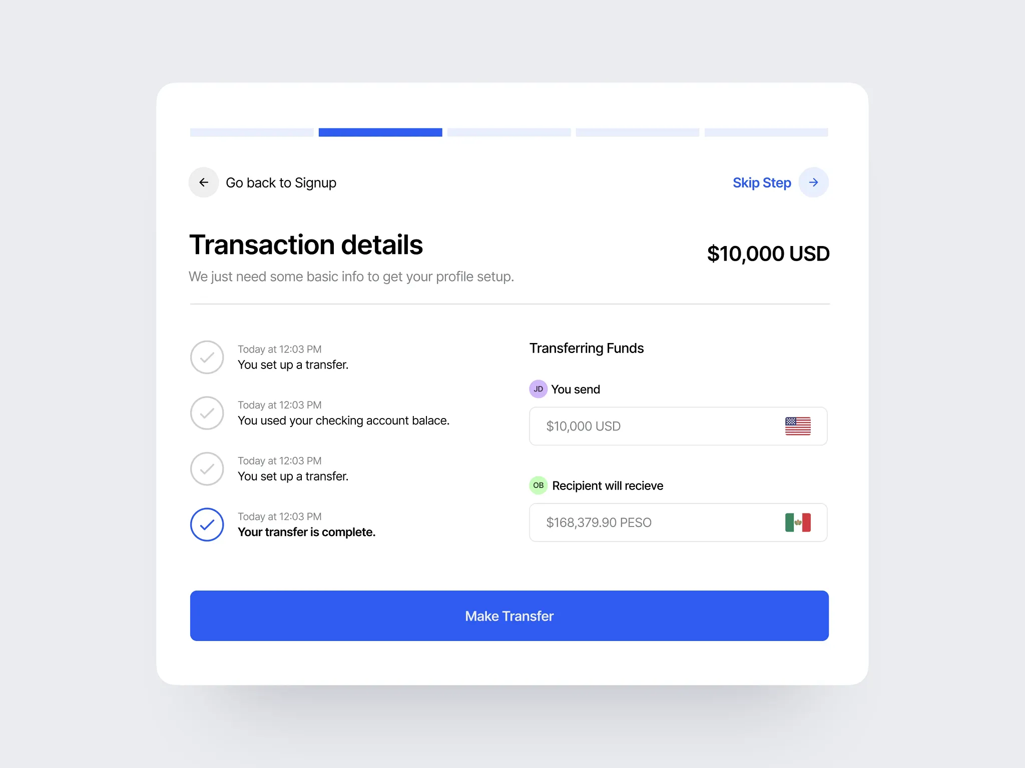
A button is slightly different on one screen.
A similar action uses different language elsewhere.
Two components solve the same problem in slightly different ways.
Each decision makes sense in isolation. Shipping matters more than alignment, and speed feels like the right tradeoff. At this stage, the cost of being inconsistent is low and mostly invisible.
That’s why it’s easy to ignore.
Why Teams Don’t Notice the Drift
Inconsistencies don’t appear all at once. They show up gradually, across time and people.
Different designers touch different features
Engineers fill in gaps pragmatically
Product decisions are made under pressure
Context gets lost between sprints
No one wakes up intending to fragment the product. Each change is rational in the moment. The problem is that there’s no shared system strong enough to pull decisions back into alignment.
Drift isn’t caused by carelessness. It’s caused by local optimization without global structure.
How Small Inconsistencies Compound
The compounding effect is where things start to feel “off.”
Users encounter:
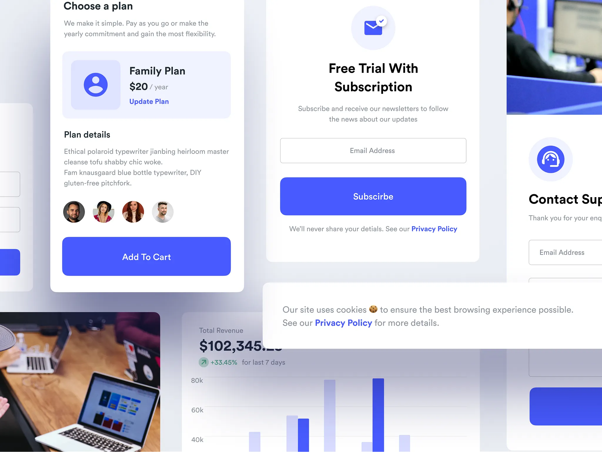
Similar actions behaving differently
Interfaces that require relearning
Patterns that can’t be trusted
This increases cognitive load. The user has to stop relying on intuition and start reading carefully. That shift is subtle, but expensive.
The product doesn’t just become harder to use. It becomes harder to trust.
That’s usually when founders say: “Nothing is technically broken, but something feels wrong.”
Why Visual Polish Doesn’t Fix the Problem
At this point, many teams reach for a redesign.
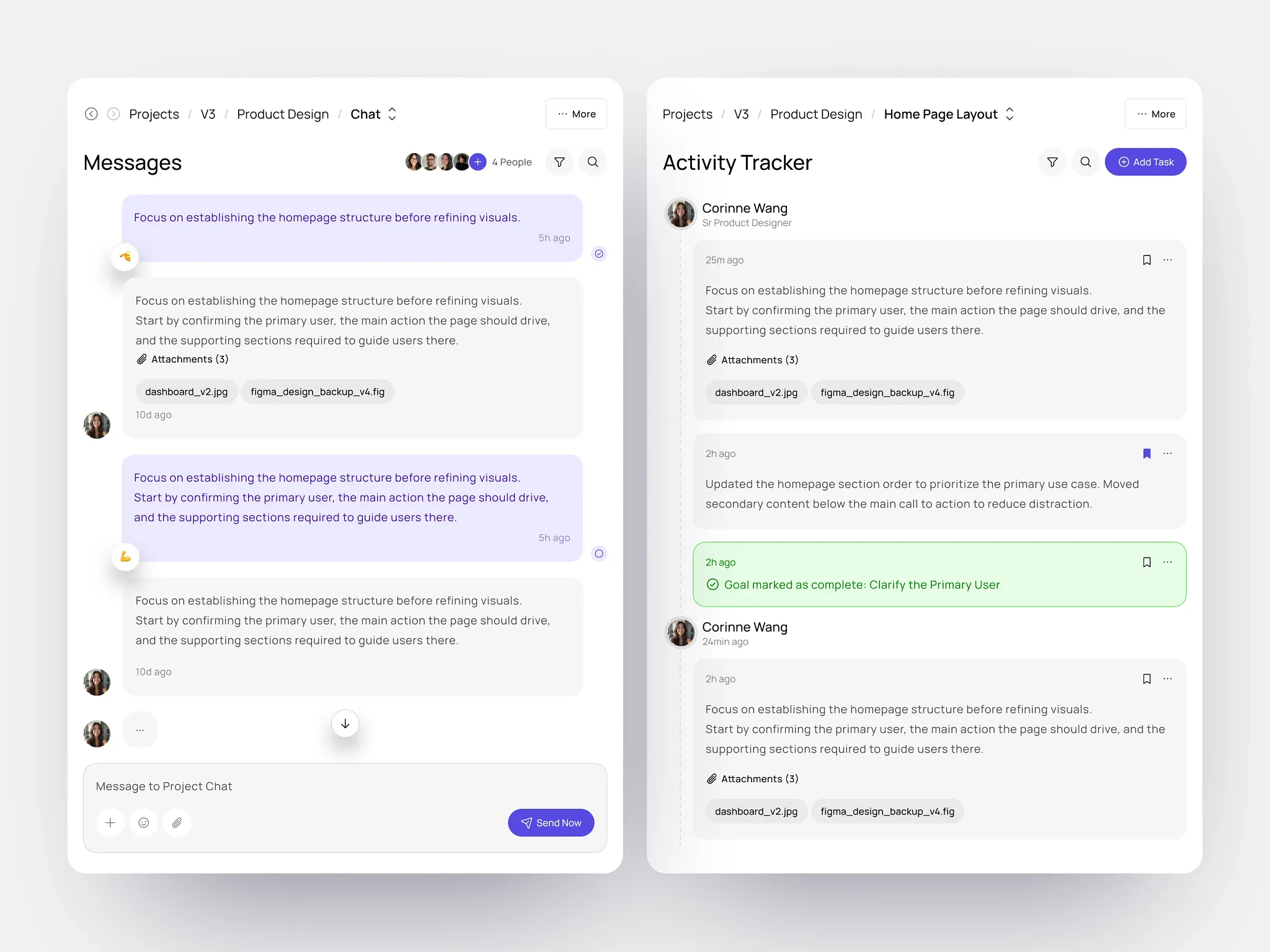
They refresh colors.
They tighten spacing.
They unify typography.
This helps briefly, but it rarely lasts.
Without addressing the underlying system, the same drift returns. New features reintroduce inconsistencies. Edge cases multiply. The product slowly slides back into the same state, just with a different coat of paint.
Polish treats symptoms.
Structure treats causes.

How to Spot Drift Early
Drift is much easier to prevent than to clean up. The problem is that most teams only notice it once the product already feels unreliable. There are a few early signals that show up long before things feel “broken.”
One sign is when similar features start requiring explanations. If teammates have to ask, “Is this the same as that other thing?” or “Why does this work differently here?”, inconsistency is already creeping in.
Another signal is decision fatigue inside the team.
When small design choices turn into repeated debates: spacing, labels, component behavior, it usually means the system isn’t carrying enough of the load.
Drift also shows up when changes feel harder than they should. If adding a new feature requires touching many unrelated screens, or if small updates create unexpected side effects, the product is losing structural coherence.
Finally, pay attention to workarounds. When designers or engineers start copying existing UI “because it’s close enough,” rather than because it’s correct, the system is no longer guiding decisions.
None of these are emergencies on their own. But taken together, they’re early warnings. Catching them early gives teams a chance to reinforce structure before inconsistency compounds into something much harder to unwind.
What Actually Prevents Inconsistency
Consistency doesn’t come from better taste. It comes from shared constraints.
That usually means:
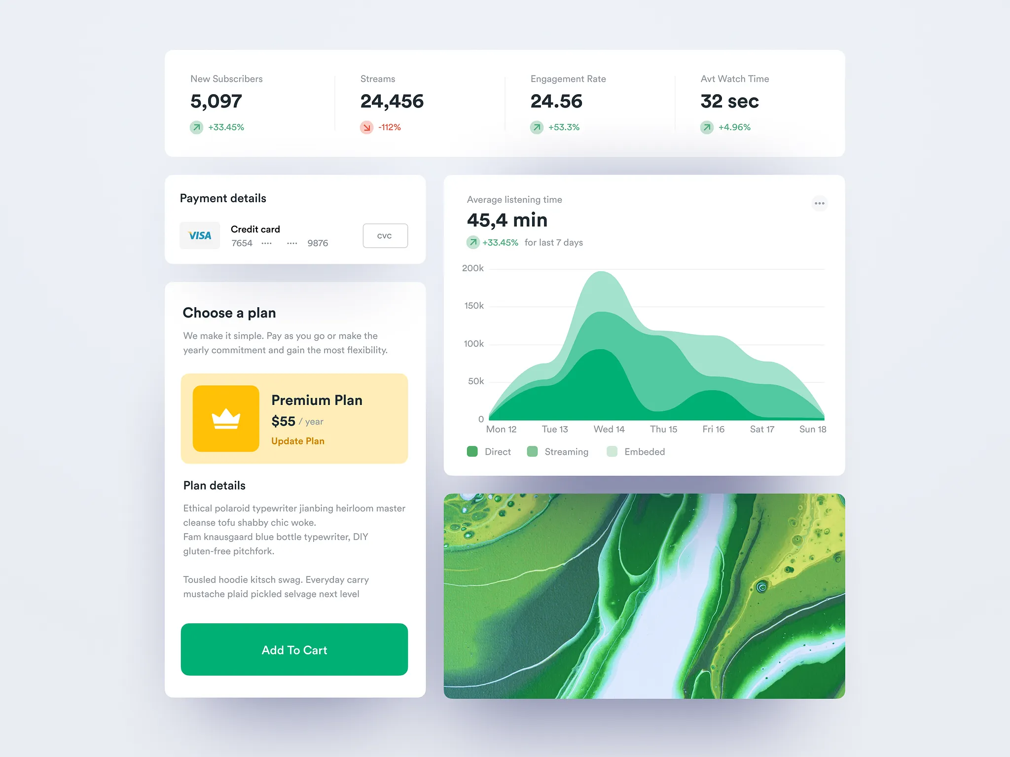
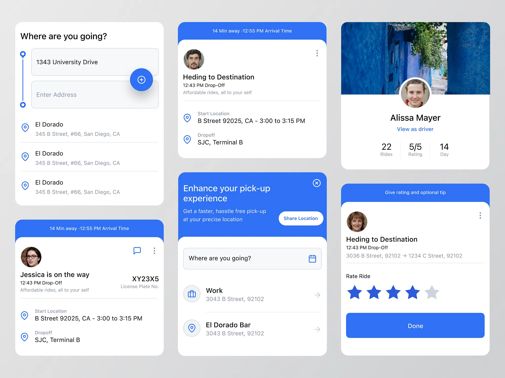
Clear layout and hierarchy rules
Tokens that encode decisions instead of preferences
Components that enforce behavior, not just visuals
A process that protects the system as the product evolves
When these are in place, teams don’t have to remember how things should work. The system does that for them.
Consistency becomes the default, not an ongoing debate.
Why This Matters More as Products Scale
As products grow:
More people touch the interface
More edge cases appear
More decisions are made under time pressure
Without a system, inconsistency becomes operational debt. It slows teams down, increases rework, and makes every new feature harder to ship confidently.
What felt like a minor issue early becomes a structural liability later.
Why Visual Polish Doesn’t Fix Structural Drift
When a product starts to feel inconsistent, most teams reach for polish. It’s the most visible lever, and it feels productive.
Colors get refreshed.
Spacing gets tightened.
Typography gets unified.
The interface looks cleaner, and for a moment, things feel better. But the improvement rarely lasts.
That’s because polish operates at the surface. It standardizes how things look, not how they behave or how decisions are made.
If the underlying structure is fragmented, visual consistency can only mask the problem temporarily.

What usually happens next is predictable.
New features introduce new exceptions. Edge cases require one-off solutions. Small deviations sneak back in because there’s nothing enforcing consistency beneath the visuals. The product slowly returns to the same state it was in before, just with a newer coat of paint.
Without structure, teams are forced to rely on memory and judgment for every small decision.
Designers debate spacing. Engineers copy patterns that are “close enough.” Product managers approve exceptions because shipping feels more urgent than alignment.
Over time, those local decisions override whatever consistency polish initially created.
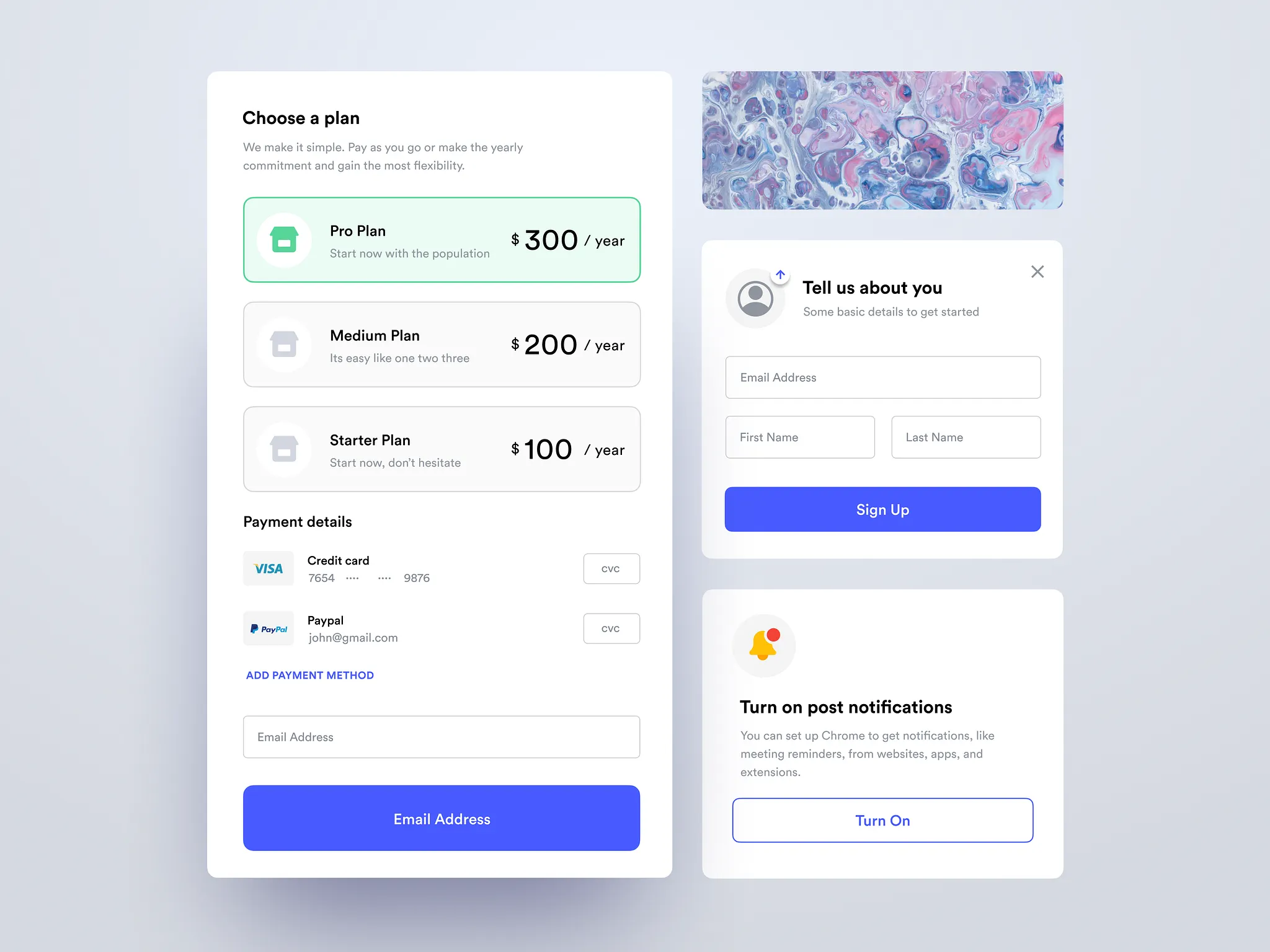
Structure works differently. It sets boundaries before decisions are made.
Clear layout rules define what’s allowed and what isn’t.
Tokens encode choices so they don’t need to be reconsidered.
Components enforce behavior, not just appearance.
When structure is in place, consistency doesn’t depend on vigilance. It becomes the default outcome of the system.
This is why redesigns that focus on visuals alone tend to repeat. The team fixes what’s easiest to see, not what’s hardest to maintain. Until the product has a shared structure strong enough to absorb change, polish will always lag behind drift.
Polish makes products look better today.
Structure determines whether they still feel coherent tomorrow.
How to Set Up a Design System That Holds Up Over Time
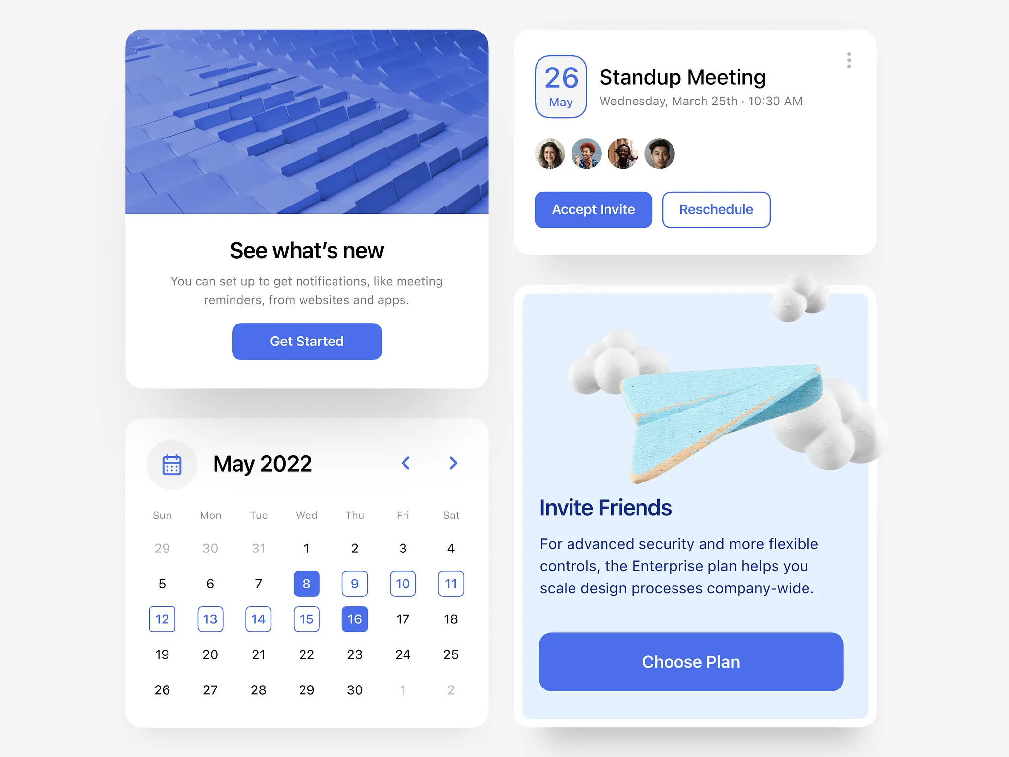
Step | What to focus on | Why it matters |
|---|---|---|
Start with workflows | Identify the core flows users repeat | Systems should serve behavior, not screens |
Define structural rules first | Layout, spacing, hierarchy | Prevents inconsistency before visuals exist |
Encode decisions as tokens | Color, spacing, typography | Removes subjective choices from daily work |
Build components around behavior | States, interactions, constraints | Stops one-off UI solutions from creeping in |
Document intent, not just usage | Why rules exist | Helps new work stay aligned without micromanagement |
Review the system regularly | Compare new features against rules | Catches drift early before it compounds |
Closing Thought
Products rarely feel broken because of one bad decision. They feel broken because too many small decisions were made without a system to hold them together.
Consistency isn’t about aesthetics.
It’s about predictability.
And predictability is what allows users and teams to trust a product as it grows.
Does this sound familiar?
Many teams reach out when their product feels hard to use, or harder to evolve than expected. If you’re dealing with that kind of friction, leave your details below and I’ll follow up within a day.
More Blog Posts
Design Systems
AI Design Systems: How Teams Are Syncing Figma and Code in Real Time
How AI-driven design systems are helping SaaS teams keep Figma and code in sync, reduce design debt, and build more consistent products.
Product Strategy
Should You Build a Landing Page Before Your SaaS MVP?? What It Validates (And What It Doesn’t)
Many founders start with a landing page before the product exists. Sometimes it clarifies the idea, other times it creates a story the product can’t support. This post explains when it helps and when it delays real decisions.

Design Systems
Why Small Inconsistencies Make SaaS Products Feel Broken
Small inconsistencies compound over time, quietly eroding predictability and trust. This post explains why products start to feel broken even when no single screen is obviously wrong.
UX Design
Our SaaS Dashboard Is Overwhelming. How Do We Simplify It?
If your SaaS dashboard feels cluttered, it’s usually a structural problem, not a UI one. This post explains the patterns that create overload and how to simplify with intent.
SaaS Websites
What the Best SaaS Websites Have in Common
The best SaaS websites don’t sell features. They clarify the problem, show the workflow, and reduce cognitive load. Here’s how.
UX Design
How to Design a SaaS App the Most Efficient Way (Without Cutting Corners)
A practical workflow to design SaaS fast without wasting cycles, clarity first, UI later.
