The data models we built to handle accounting for 25k+ investment vehicles
—
7
Min
Read
When you look closely at the strongest SaaS websites, clear patterns start to emerge. These aren’t about aesthetics. They’re about how quickly a product makes sense to the right person.
Key Takeaways
The strongest SaaS websites clarify the problem before they explain the product.
One primary user and one core workflow beats trying to speak to everyone.
Showing how work flows builds understanding faster than showing more screens.
Reducing cognitive load creates trust more effectively than adding features or hype.
Across different industries and price points, the strongest SaaS websites tend to converge on the same fundamentals. These aren’t stylistic choices or branding trends. They’re structural decisions that make products easier to understand at a glance.
The first and most consistent pattern shows up before features, screenshots, or pricing are mentioned.
They Clarify the Problem Before the Product
The strongest SaaS websites don’t start by explaining what the product is. They start by clarifying the problem the visitor already recognizes.
By clarifying the problem first, the site answers the most important question immediately: “Is this for me?”
Only after that question is settled does the product itself matter.
This ordering is intentional. When a website leads with the product, visitors are forced to reverse-engineer relevance.
When a website leads with the problem, the mental effort drops. Visitors recognize themselves in the description and lean in. The product becomes a potential solution, not something they need to decode.
You can see this pattern across very different SaaS categories. Finance tools, developer platforms, internal tools, and productivity software all do this well when they’re mature.
The specifics change, but the structure stays the same: problem first, product second.
This approach also acts as a filter. By naming the problem clearly, the site quietly disqualifies the wrong audience. People who don’t experience that friction move on. People who do feel understood.
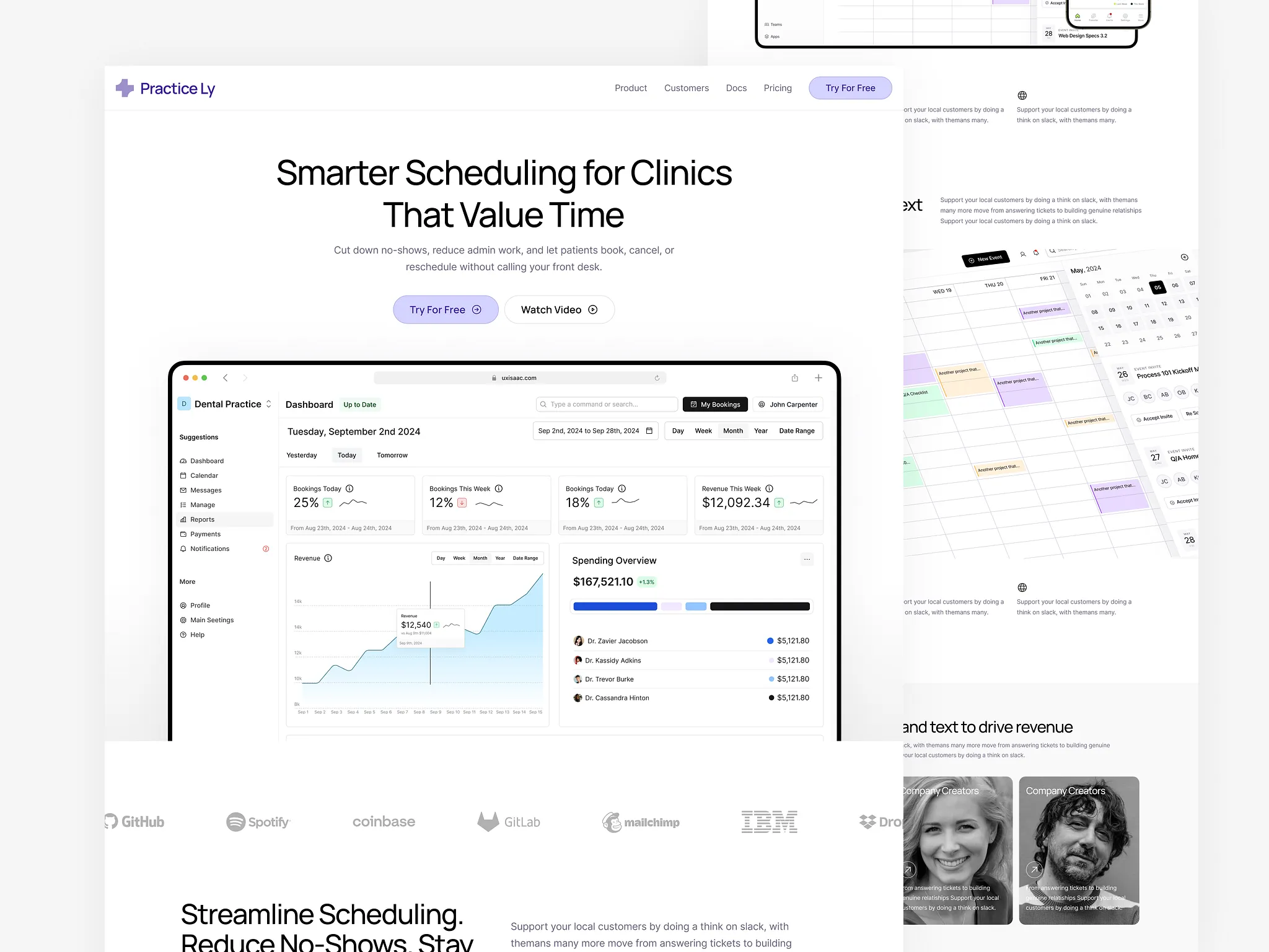
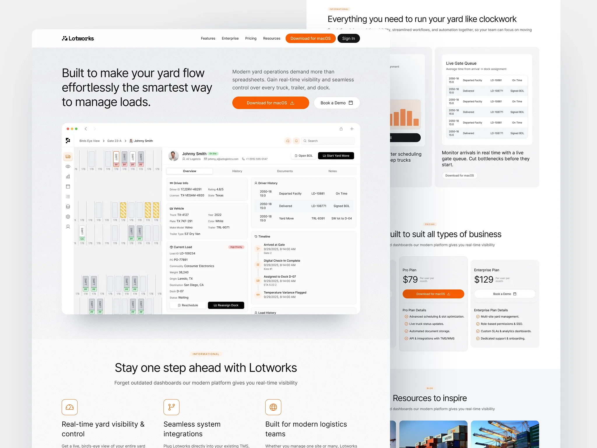
They Make the Primary User Obvious
The best SaaS websites don’t try to speak to everyone. They make it clear who the product is for, quickly and without forcing the visitor to guess.
The primary user is obvious from the first screen, not buried in a long list of roles or use cases.
This matters because most SaaS products are multi-stakeholder. A tool might be used by operators, managers, admins, finance, and leadership.
If the website tries to address all of them at once, the message gets diluted. Everyone understands it a little, but no one feels like it’s meant for them.
Even if the product later expands to multiple audiences, the first impression stays focused.
You can usually tell this is happening when the site answers three questions immediately:
Who is this for?
What do they do all day?
What gets easier if this works?
When those answers are clear, the rest of the site becomes easier to understand.
The best SaaS websites feel simple because they commit early. They choose a primary user, speak to them directly, and let everyone else self-select from there.
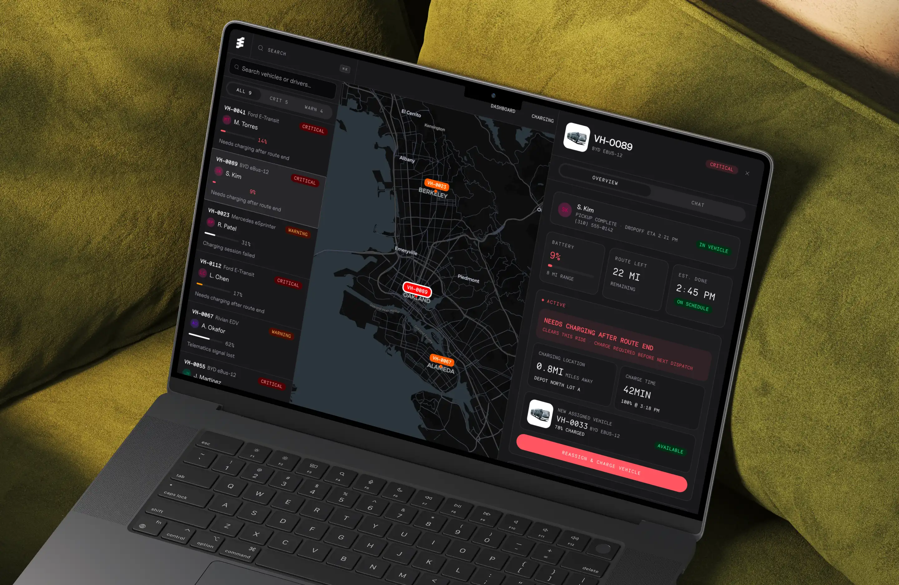
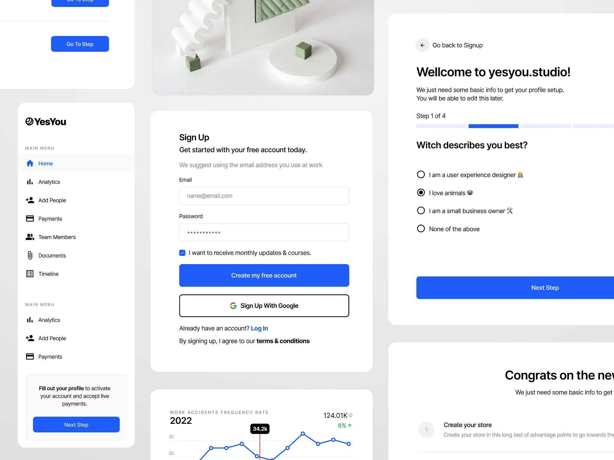
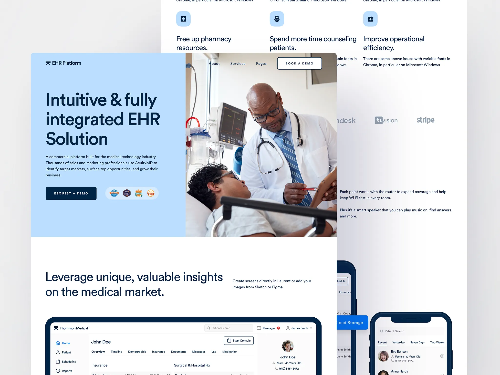
They Show the Workflow, Not Just Screens
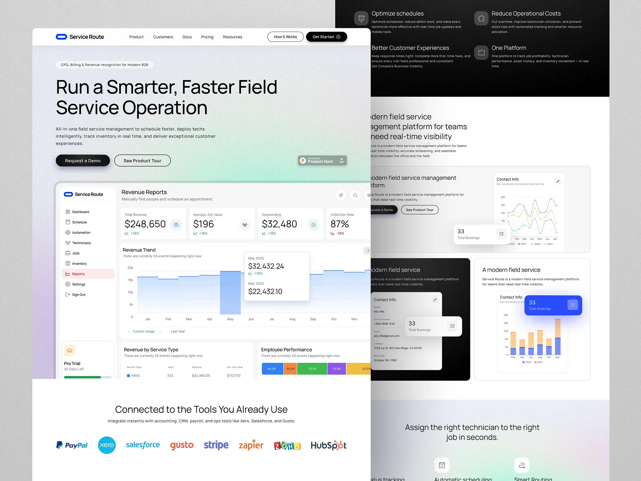
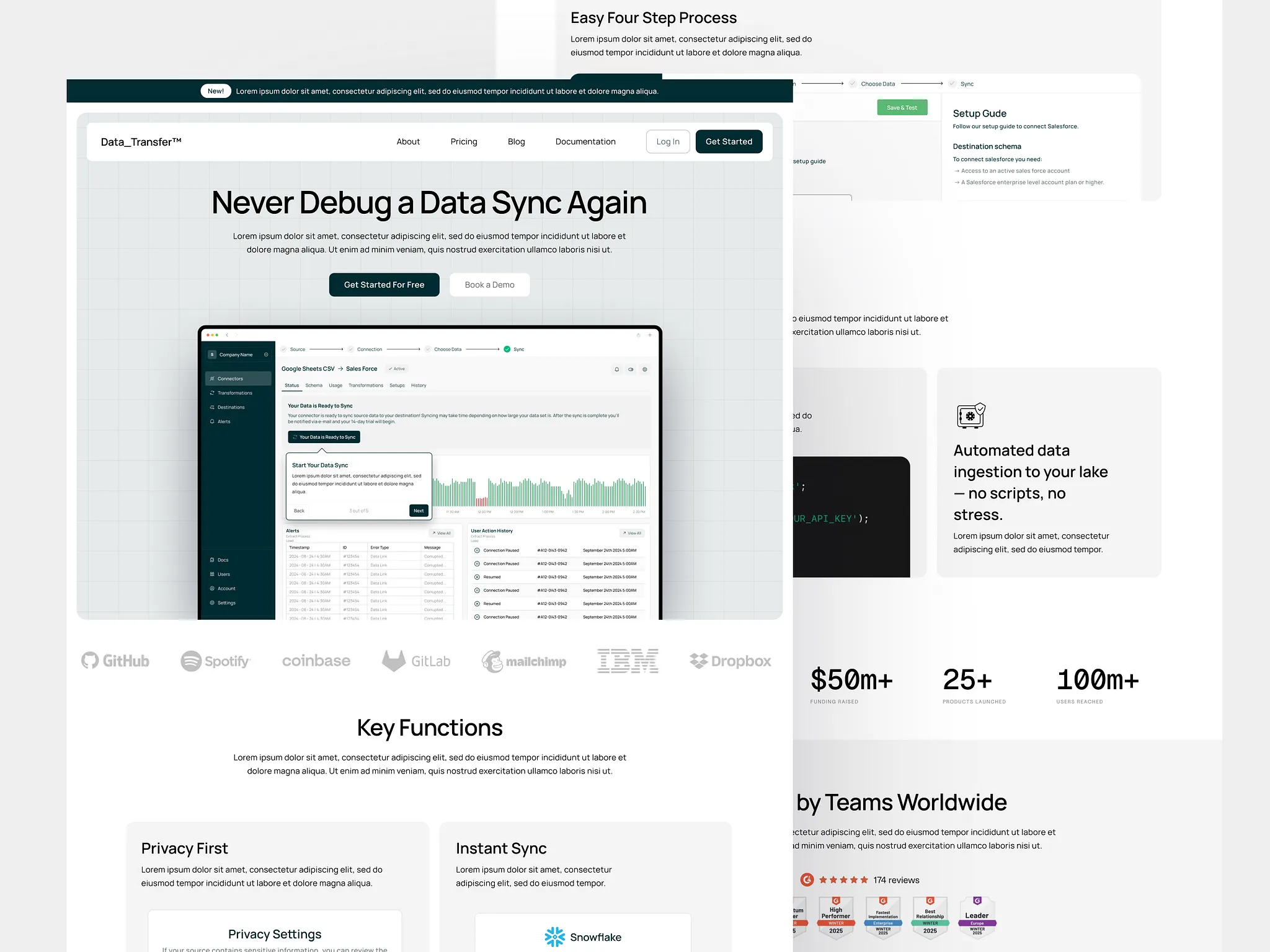
The strongest SaaS websites don’t rely on isolated screenshots to explain the product. They show how work moves through the system.
Instead of presenting individual interfaces as artifacts, they help the visitor understand what happens first, what happens next, and where the product fits into a real workflow.
Screens on their own are ambiguous. A dashboard, a table, or a form doesn’t explain when it’s used, why it matters, or what decision it supports.
Visitors are left to infer the flow, which adds unnecessary cognitive work at the exact moment you want clarity.
When a workflow is clear, screenshots stop feeling like decoration. They become evidence. The visitor doesn’t need to imagine how the product works in practice, they can see it unfolding.
This is especially important for complex or ops-heavy products, where value isn’t in any one screen, but in how multiple steps connect. The product earns trust not by looking sophisticated, but by making the process understandable.
They Reduce Cognitive Load on the Homepage
The best SaaS websites don’t try to explain everything at once. They’re intentionally incomplete.
Instead of listing every feature, use case, and benefit, they limit how many ideas compete for attention on the first screen. This restraint is what makes them feel clear.
Cognitive load increases when visitors are asked to make too many decisions too quickly.
Multiple value propositions, overlapping CTAs, dense copy, and competing visuals all force the brain to work harder just to understand what matters.
Most visitors respond by skimming, scrolling, or leaving.
Strong websites design the homepage as an orientation layer, not a sales pitch.
They prioritize a single narrative.
One primary problem.
One primary user.
One clear next step.
Everything else is deferred until the visitor has enough context to care.
You can usually spot this pattern when a homepage answers three things and then stops:
What this is
Who it’s for
Why it exists
Anything beyond that is progressively revealed, not dumped upfront.
This isn’t about oversimplifying the product. It’s about respecting the visitor’s limited attention.
They Earn Trust Without Over-Explaining
The strongest SaaS websites don’t try to prove credibility all at once.
They don’t overwhelm visitors with claims, logos, metrics, or long explanations meant to remove every possible doubt upfront.
Instead, they earn trust gradually, by making the product feel understandable and competent.
Trust rarely comes from volume. It comes from coherence.
When a website over-explains, it often signals uncertainty. Too many promises, too many guarantees, or too much defensive copy forces visitors to evaluate claims instead of understanding the product. That creates friction at the wrong moment.
Well-designed SaaS sites take a quieter approach. They place trust signals where questions naturally arise, not all at the top.
A short line about who uses the product appears when relevance is clear. A brief metric shows up near pricing, not before the value is understood. A case study reinforces a workflow that already makes sense.
Nothing feels forced. Nothing feels like persuasion.
The best SaaS websites don’t ask for trust.
They make it reasonable to give.
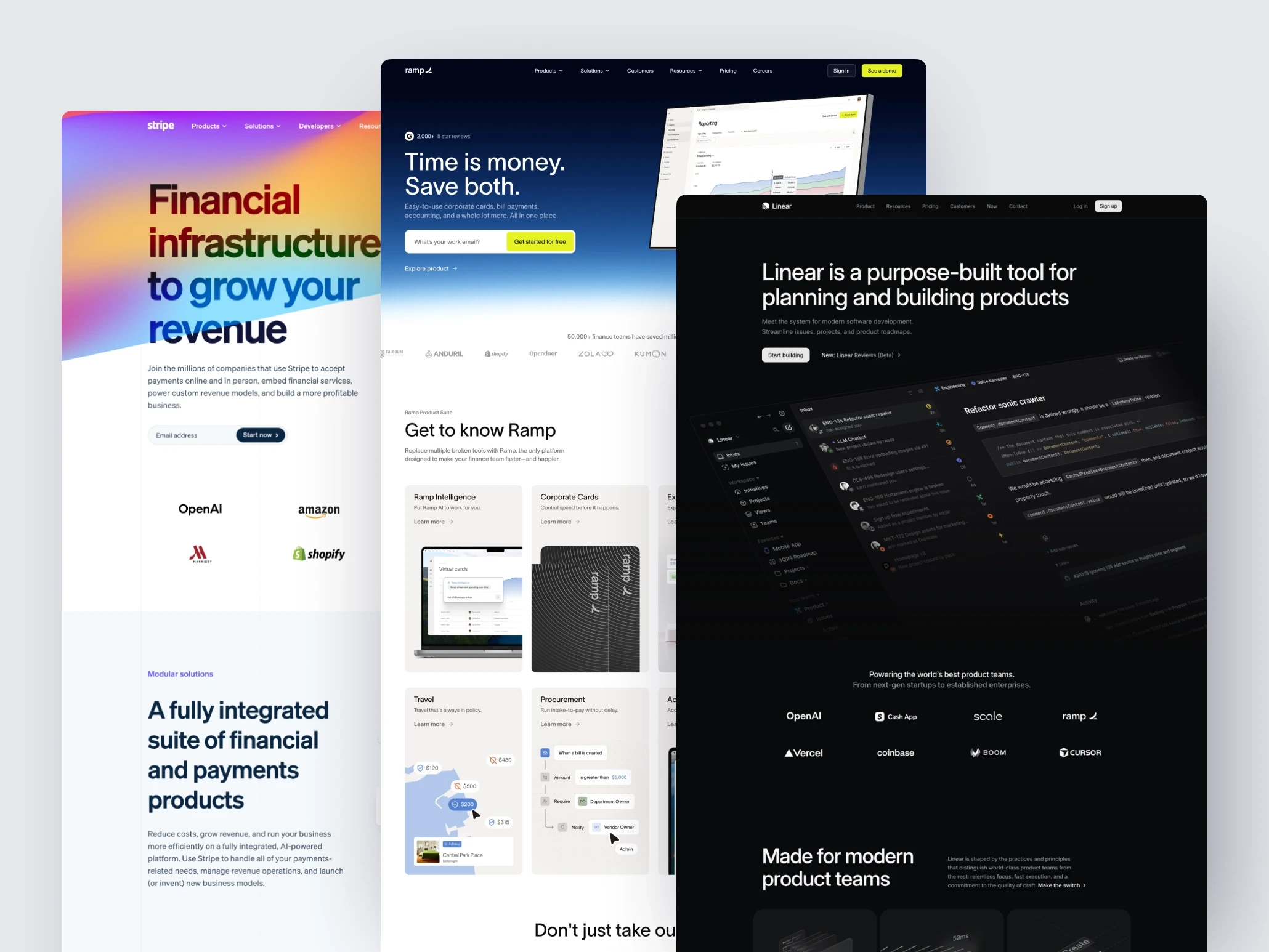
SaaS Website Examples & Why Are They Industry Standard
Company | What the Product Is | What the Homepage Clarifies Immediately | Pattern It Gets Right | What Founders Can Steal |
|---|---|---|---|---|
Issue tracking for product teams | What problem it replaces and how work flows through it | Ruthless focus on one workflow | Say no to secondary use cases on the homepage | |
Corporate cards and spend control | Who it’s for and what pain it removes | Calm, confidence-driven clarity | Reduce hype, increase legibility | |
App deployment infrastructure | What happens after you connect your repo | Workflow over marketing fluff | Show the “next step” visually | |
Daily planning for knowledge workers | The behavioral change it enforces | Outcome-first storytelling | Sell the habit, not the feature | |
Payments infrastructure | The primary action developers want to take | Clear primary CTA hierarchy | Make the main action obvious |
Closing Thoughts
When you step back and look at the strongest SaaS websites side by side, what stands out isn’t creativity or cleverness. It’s restraint. These sites make deliberate choices about what to say, who to say it to, and when to stop explaining.
They clarify the problem before the product.
They make the primary user obvious.
They show how work flows through the system.
They reduce cognitive load instead of adding to it.
They earn trust by being coherent, not loud.
None of this is accidental. It’s the result of treating the website as part of the product, not a marketing layer on top of it.
The same principles that make a good SaaS interface apply here: clarity, predictability, and respect for the user’s attention.
The best SaaS websites don’t try to win everyone in the first few seconds. They focus on helping the right people understand quickly, and let them decide for themselves.
That’s what makes them work.