The data models we built to handle accounting for 25k+ investment vehicles
—
5
Min
Read
Most SaaS dashboards become overwhelming because they try to solve too many jobs at the same time. Features pile up, edge cases creep in, and the interface slowly shifts from a decision-making tool into a cluttered control panel. This post breaks down why that happens and how to simplify a dashboard without stripping away the functionality operators actually rely on.
Key Takeaways
If a metric doesn’t drive a decision or action, it doesn’t belong on the main view.
Clear grouping and visual hierarchy reduce overwhelm more than removing features.
Dashboards should provide orientation, detailed analysis should live one level deeper.
Simplified visuals outperform dense charts for everyday decision-making.
Small amounts of context, like microcopy and tooltips, prevent confusion early.
Testing with just a few real users quickly exposes hierarchy and clarity issues.
Before simplifying a SaaS dashboard, it helps to step back and define what the dashboard is actually responsible for. These steps focus on reducing cognitive load while preserving the signals users need to make confident decisions.
1. Start with: “What’s the one thing the user needs to understand first?”
Every dashboard should have a primary storyline.
Not five. Not ten. One.
Ask yourself:
What decision is the user trying to make when they open the dashboard?
What’s the most important signal?
What drives action?
If the hierarchy isn’t obvious, users default to scanning everything — and that’s where overwhelm starts.
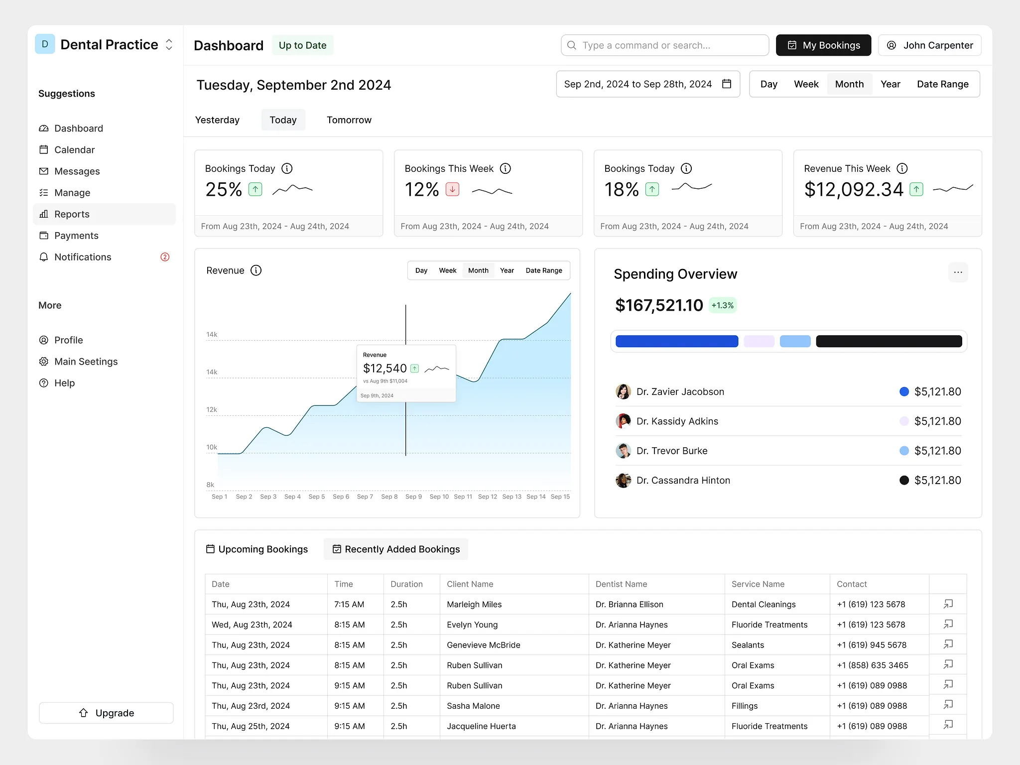
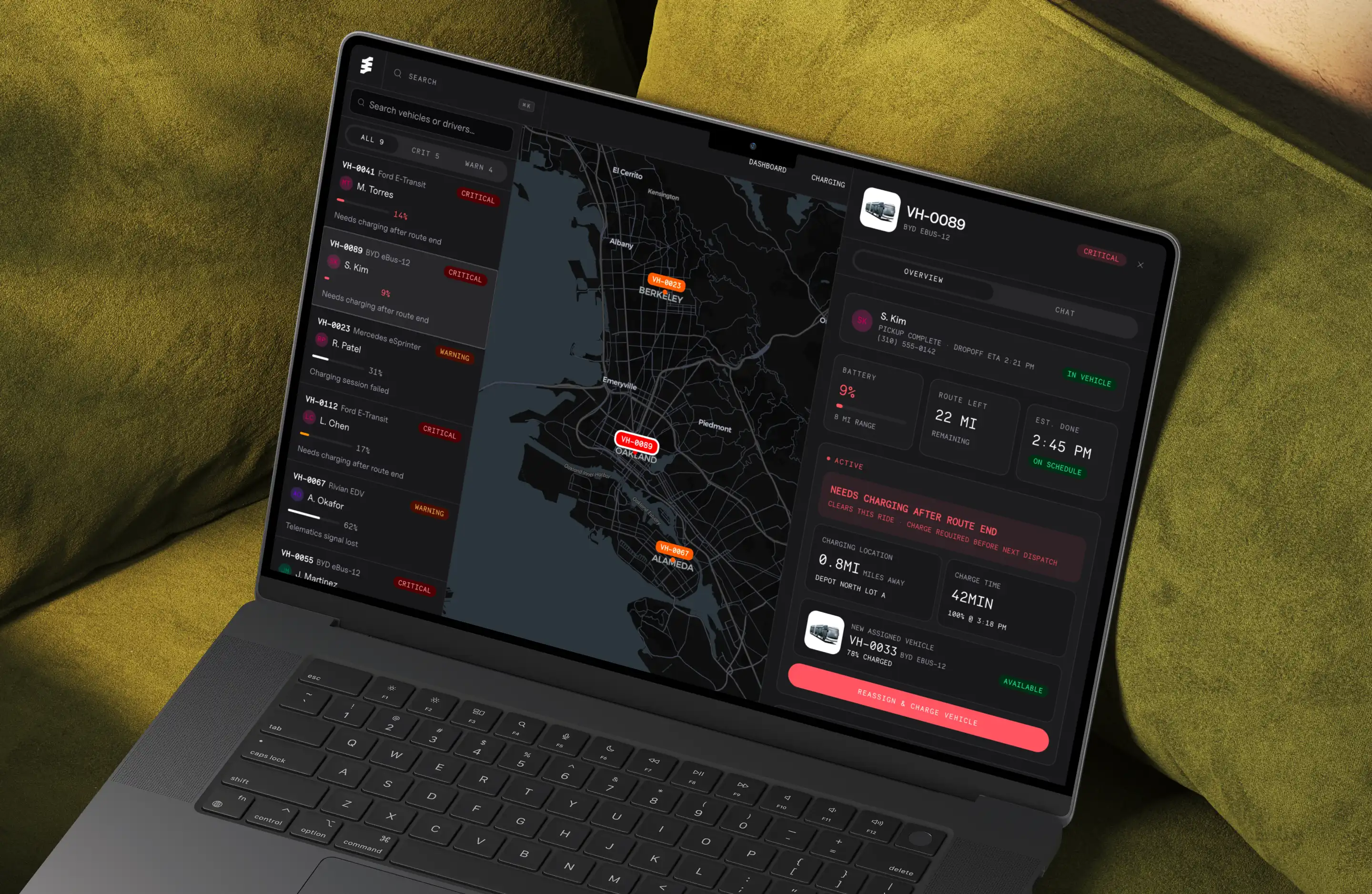
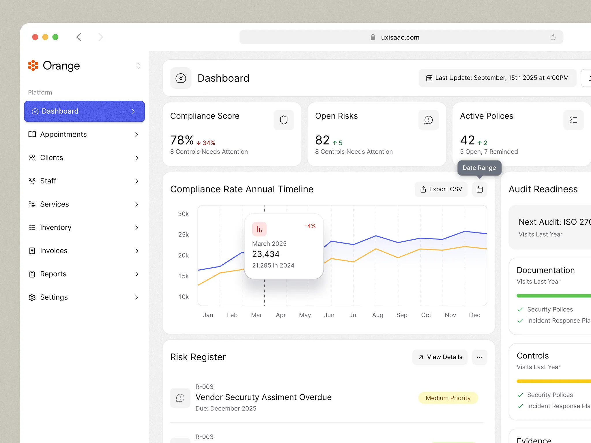
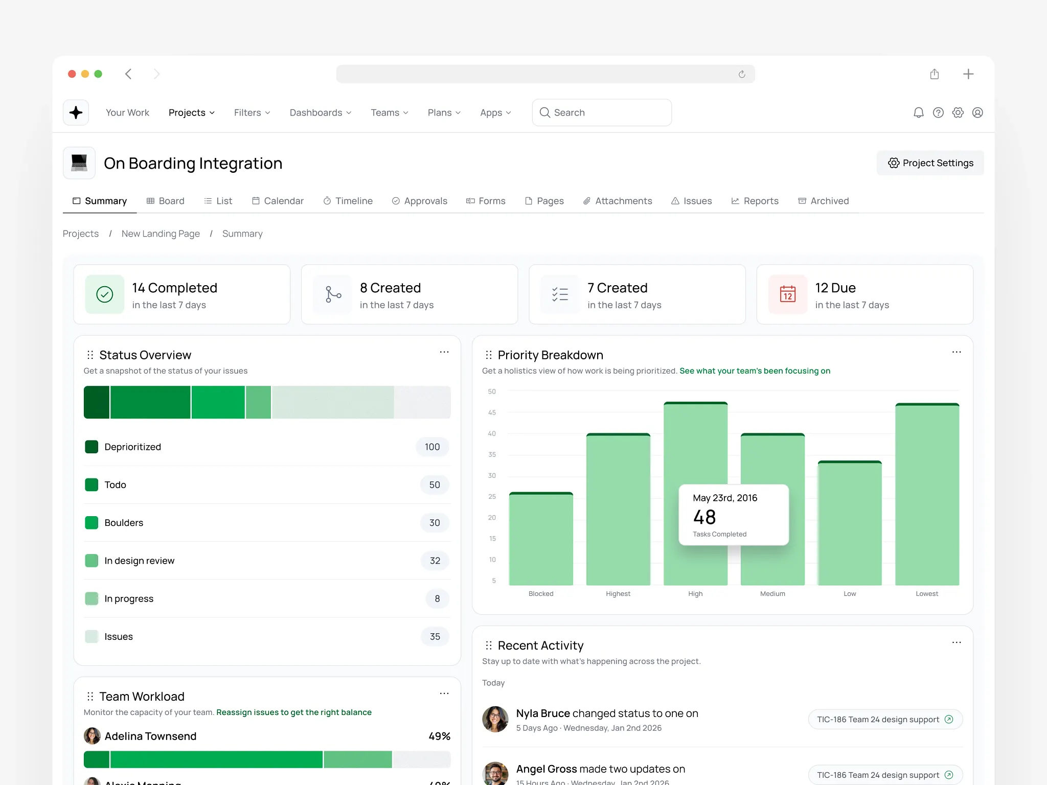
2. Group related information into clear sections
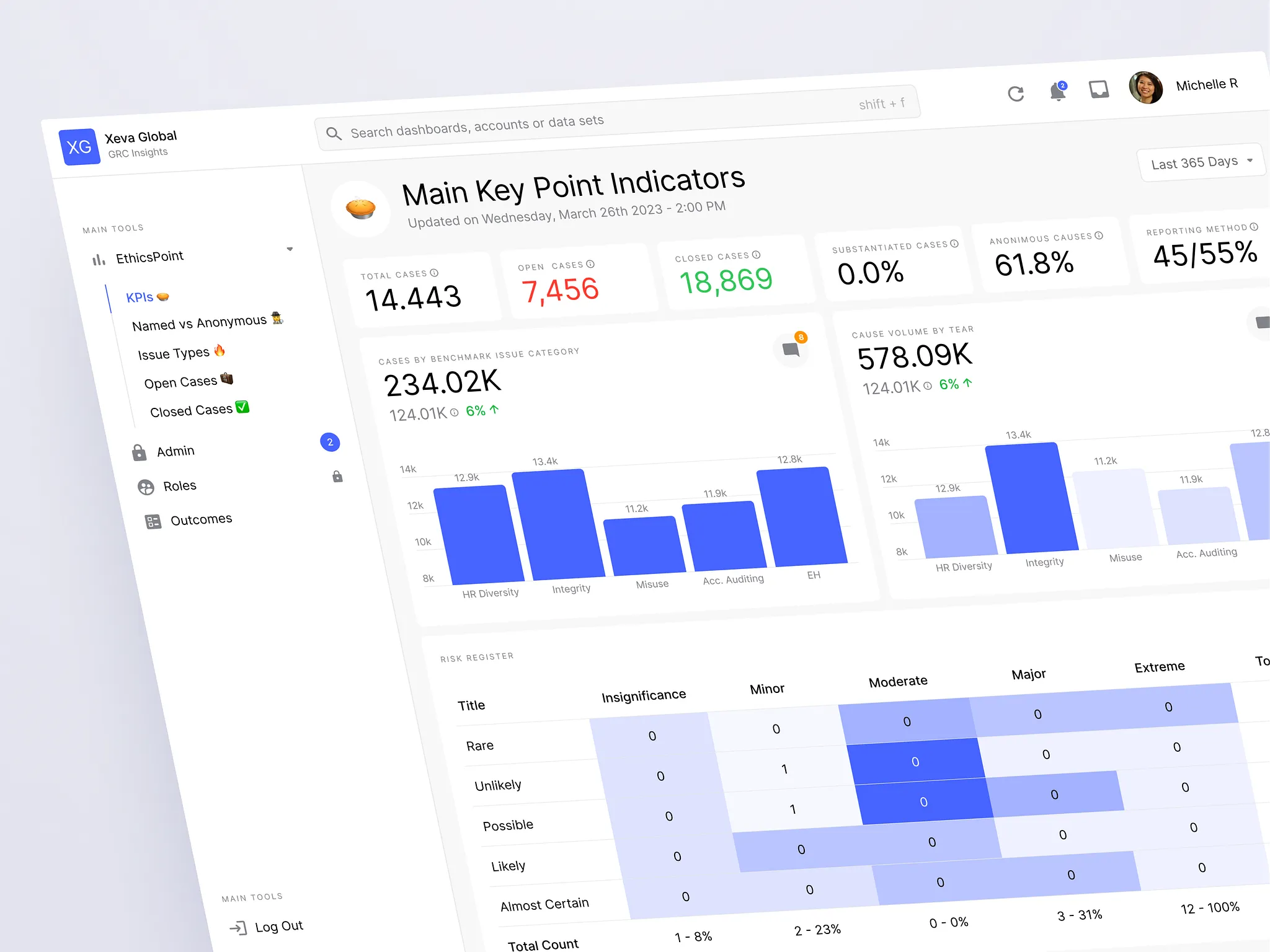
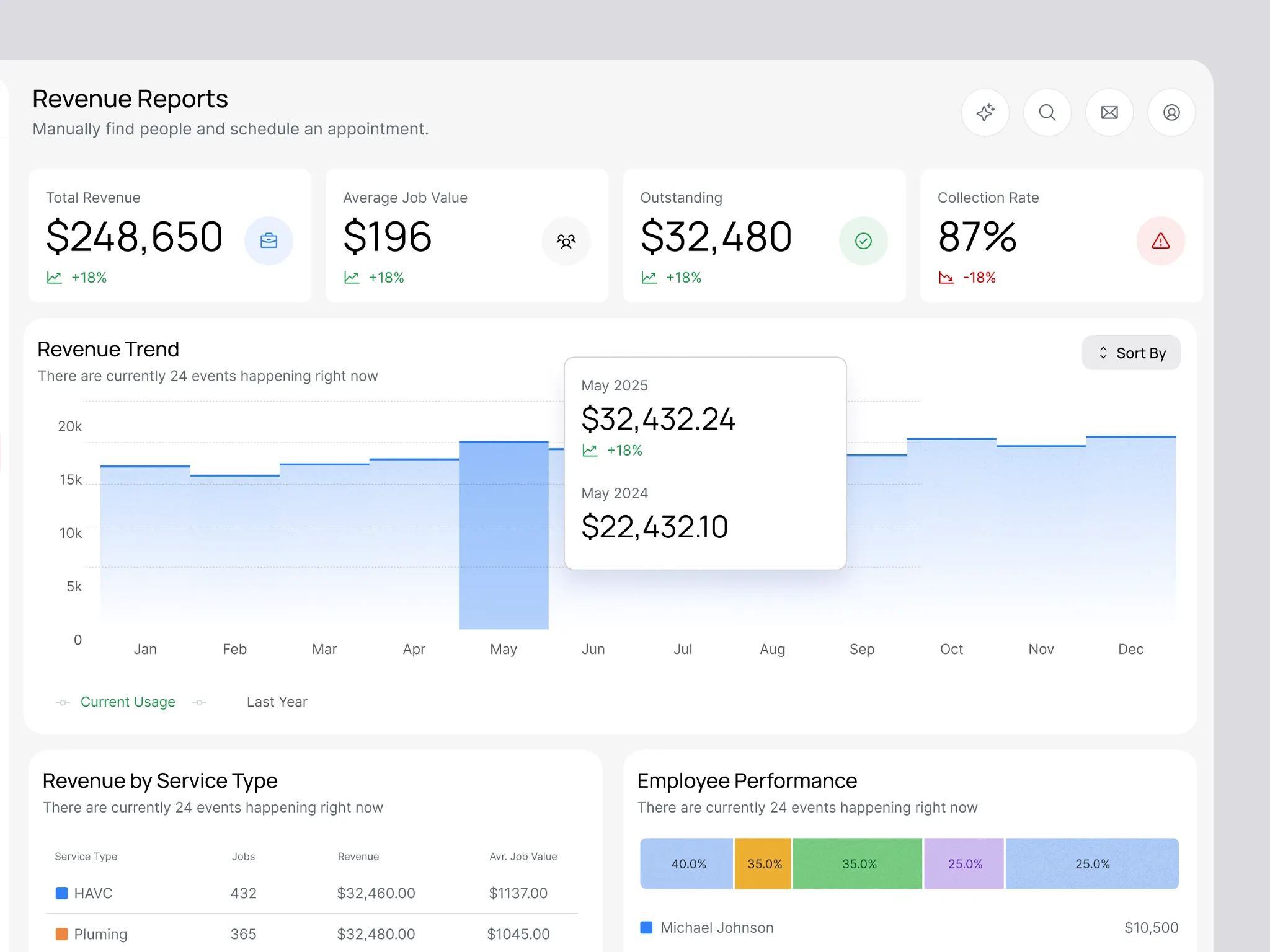
Most dashboards feel overwhelming because everything competes for attention at once. Clear groupings instantly create order.
For example:
Performance overview
Operational alerts
Tasks / to-dos
Key metrics
Users can process sections much faster than scattered, unrelated components.
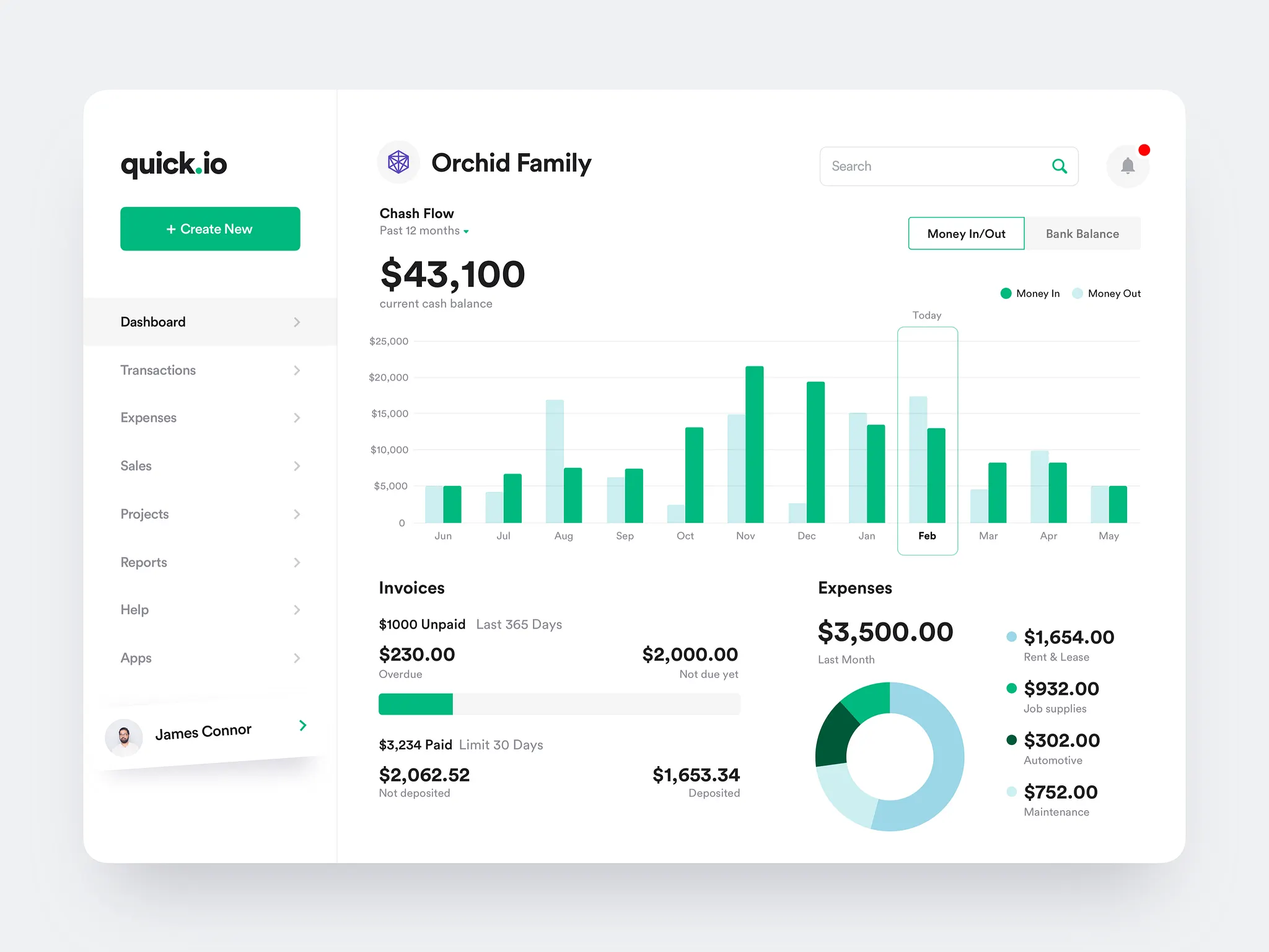
3. Use visual hierarchy to guide the eye
Hierarchy is how users know where to look first.
Use:
Larger type for what matters most.
Clear spacing between sections.
Consistent component sizes.
One accent color (not three).
Simple, repeatable layout patterns.
Good dashboards feel calm because they reduce visual noise.
4. Remove anything that doesn’t help a decision
Dashboards don’t need to show everything — only what’s useful right now.
Ask:
Is this helping the user understand something meaningful?
Is this metric actionable or just “nice to know”?
If this disappeared, would anyone notice?
Most dashboards become dramatically clearer by removing 10–20% of low-value noise.
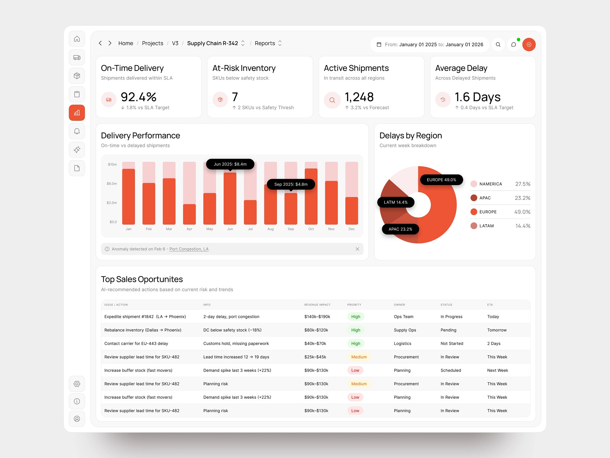
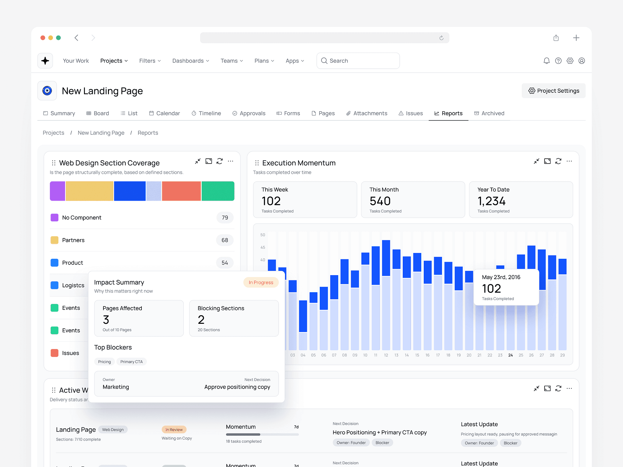
5. Replace dense charts with simplified visuals
Founders often default to heavy charts that look impressive but overwhelm users.
Instead:
Use spark lines for quick trend context.
Use progress bars for completion and status.
Use single KPI tiles instead of multi-line graphs.
Use color only to highlight exceptions or risks.
Clarity beats complexity, every time.
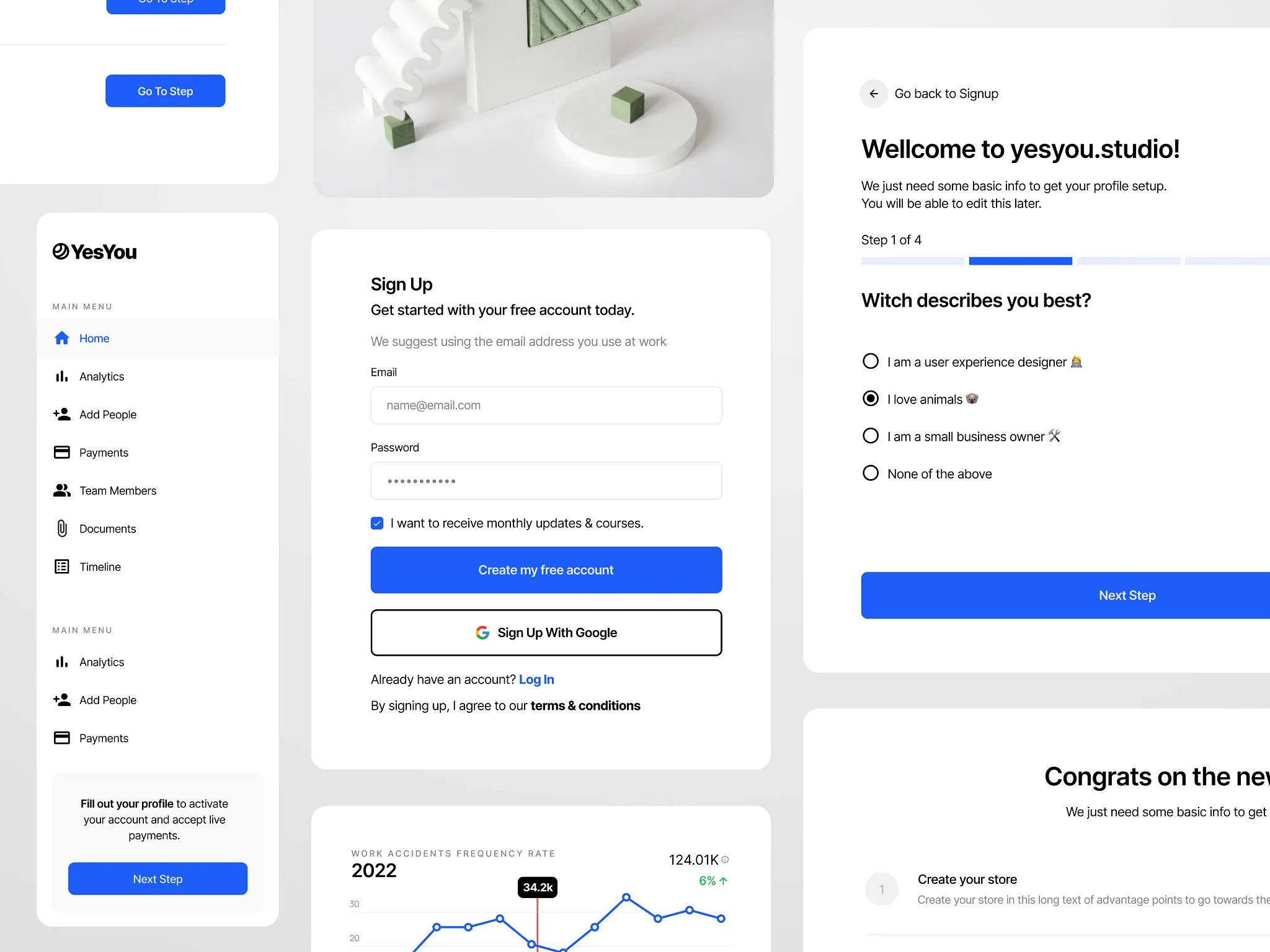
6. Add context where users get stuck
Confusion usually comes from missing context, not bad data.
Add:
Tooltips and short explanations.
Microcopy that explains why, not just what.
Clear labels and empty-state examples.
A small amount of context can fix a surprisingly large UX problem.
7. Test with real users (even 2–3 is enough)
You don’t need a formal usability study.
Just watch a few users open the dashboard and ask:
“What’s the first thing your eyes go to?”
You’ll know immediately whether the hierarchy is working.
What an Overwhelming Dashboard Signals vs. a Simplified One
If the dashboard feels like this… | It usually means… | A simplified dashboard does this instead |
|---|---|---|
Users scan everything | There’s no clear primary decision | Surfaces one dominant signal immediately |
Every metric feels equally loud | No visual hierarchy | Establishes a clear order of importance |
Charts look impressive but confusing | Data is shown without intent | Uses lightweight visuals tied to actions |
Users ask “What am I supposed to do?” | Missing context or guidance | Adds microcopy and inline explanations |
Teams rely on exports or reports | Dashboard isn’t trusted for decisions | Becomes the default place to decide |
New users feel lost | Too much shown too early | Reveals complexity progressively |
Nothing can be removed without debate | Metrics were added defensively | Shows only what matters right now |
Final thoughts
A simpler dashboard isn’t a weaker dashboard.
It’s one that respects users’ time and improves decision-making speed.
That clarity pays for itself through:
Faster onboarding.
Fewer support tickets.
Higher adoption.
A product that feels focused and enterprise-ready.