The data models we built to handle accounting for 25k+ investment vehicles
—
4
Min
Read
AI design systems are workflows that sync design tokens, components, and code so interfaces stay consistent as products scale.
Most SaaS teams still treat design and code as separate systems. Design lives in Figma, code lives in the product, and over time they drift. Small inconsistencies pile up and the interface starts to feel off, not because the team is doing anything wrong, but because the system is disconnected.
That’s starting to change.
Key Takeaways
Design and code drift creates product inconsistency
Design debt builds quietly over time
AI systems connect tokens, components, and code
The shift is from handoff to synchronization
Tokens are the foundation of scalable systems
Structure matters more than tools
Start small, focus on clarity and core workflows
Synced systems help teams move faster as they grow
The problem with disconnected design systems
In most products, there are two versions of the UI:
The clean version in Figma
The real version in production
They start aligned. Then things move fast. A developer tweaks spacing. A new feature introduces a slightly different button. A quick fix bypasses the system. Weeks later, the product feels inconsistent, but no single change caused it.
This is how design debt builds. Quietly.
And in ops-heavy products like logistics, EHR, or internal tools, that inconsistency slows people down. It adds friction to already complex workflows.
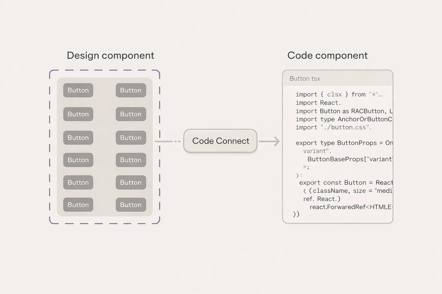
What AI design systems actually are
At a high level, AI design systems connect three layers:
Design tokens, like colors, spacing, and typography
Component systems, like tables, cards, and inputs
Code implementation in the product
Instead of managing these separately, they become part of one system.
AI helps by reading structure, applying rules, and syncing updates across layers.
Not replacing designers or developers, but reducing the manual work of keeping everything aligned.
The shift from handoff to synchronization
The old model is linear.
Design → handoff → development → drift
The new model is a loop.
Tokens define the system. Components use those tokens. Code references the same structure. Changes flow both ways.
Instead of trying to “match” design and code, they stay connected by default.
What this looks like in practice
A typical workflow now looks like this:
Tokens are defined early, either manually or with AI assistance
Those tokens are pushed into Figma as variables
Components are built using those tokens, not hardcoded values
AI tools help connect properties and clean up structure
Updates in design or code can be compared, adapted, and synced
The key shift is not the tools. It’s the structure.
Once tokens and components are consistent, the system becomes easier to maintain and scale.
Why this matters for SaaS products
As products grow, inconsistency becomes expensive.
Not visually, but operationally.
Teams spend more time fixing UI issues
New features introduce more edge cases
Onboarding new developers takes longer
Users lose trust in the interface
A synced design system reduces that overhead.
It allows teams to move faster without breaking the product.
Especially in complex dashboards, where clarity and consistency directly impact decision-making.
Where teams go wrong
Most teams don’t fail because of tools. They fail because of structure.
Common patterns:
Jumping into components without defining tokens
Inconsistent naming across files and code
Overbuilding a design system too early
Treating the system as a side project instead of core infrastructure
This is similar to clean code.
If the foundation is messy, everything built on top becomes harder to maintain.
What founders should focus on instead
You don’t need a perfect system. You need a clear one.
Start with:
A small set of tokens, colors, spacing, typography
A few core components tied to real workflows
Consistent naming that both designers and developers understand
A focus on the primary user flow, not edge cases
The goal is not completeness. It’s alignment.
Once the system is clear, it can evolve.
Is this ready for every team
Not entirely. The tooling is still early. Some workflows are rough. Setup can take effort.
But the direction is clear. Design and code are moving toward a shared system, not separate artifacts Teams that adopt this mindset early will have an advantage as their product scales.
Final takeaway
AI won’t fix a messy product. But it will amplify a well-structured system. The teams that win won’t just design better screens. They’ll build systems that stay consistent as they grow.