The data models we built to handle accounting for 25k+ investment vehicles
—
3
Min
Read
If your ops-heavy SaaS demo isn't converting, it's probably not a sales problem.
It's a UX problem disguised as one.
This is specifically about logistics, fleet management, supply chain, and field service SaaS -- products where the real complexity lives inside the workflow, not on the homepage.
Founders in these categories lose demos for the same reason: they show the product before the buyer understands the problem the product solves. The interface looks like work before it looks like relief.
This post breaks down why that happens and what to change before your next demo.
Key Takeaways
Ops SaaS demos lose buyers when the interface looks complex before it looks useful
If a fleet manager or dispatcher can't orient in 10 seconds, the demo is already behind
The demo should follow the operator's worst day, not the product's full feature set
Showing everything is not the same as showing what matters
The UX hierarchy of your demo should mirror the decision hierarchy of your buyer's job
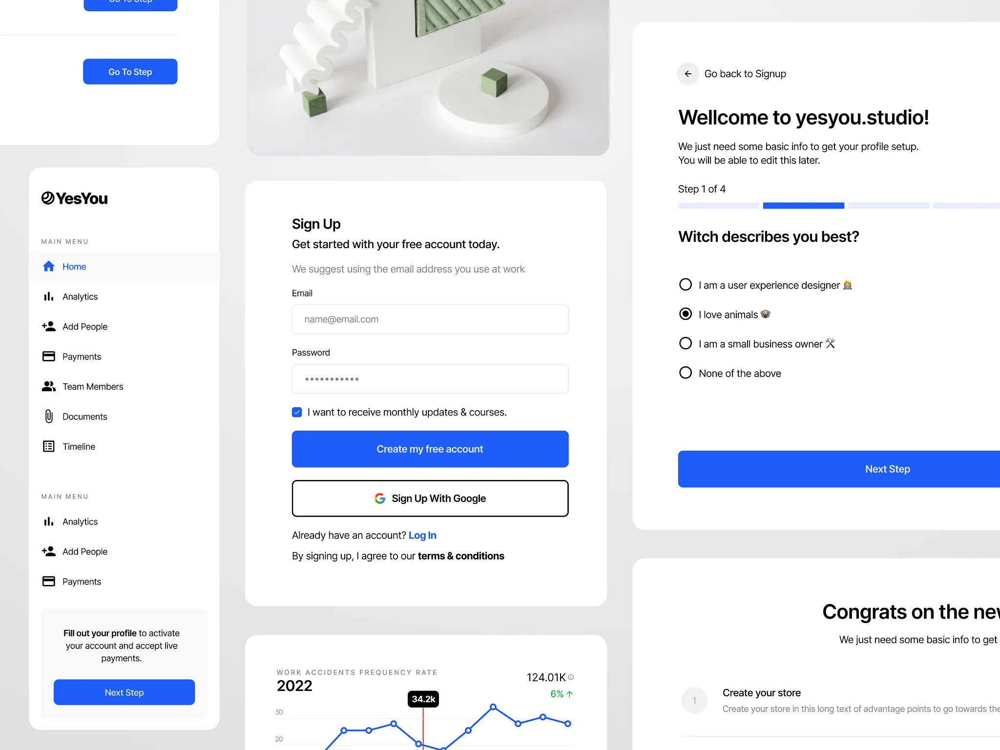
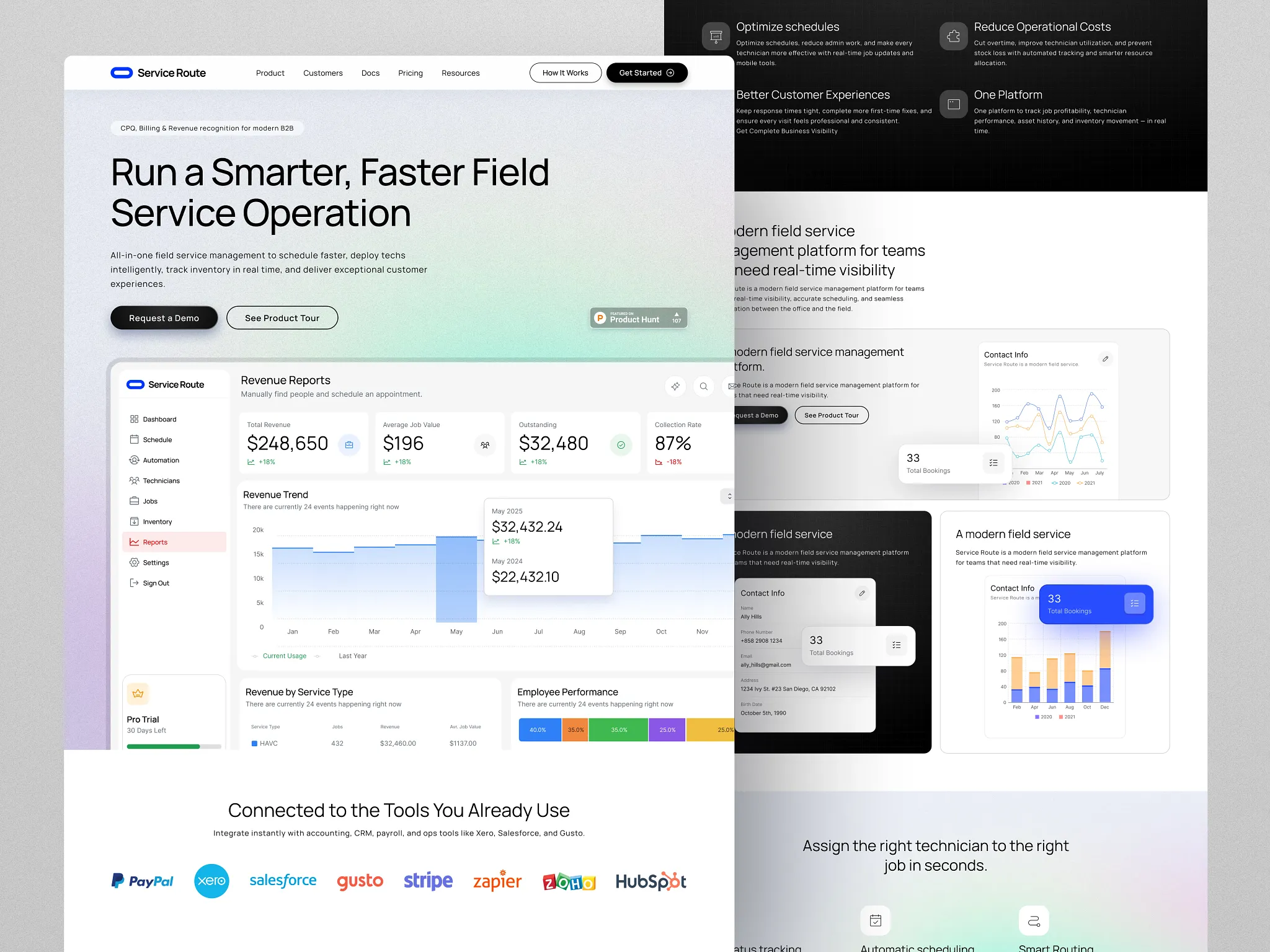
Why Ops SaaS Demos Lose Buyers Mid-Walkthrough
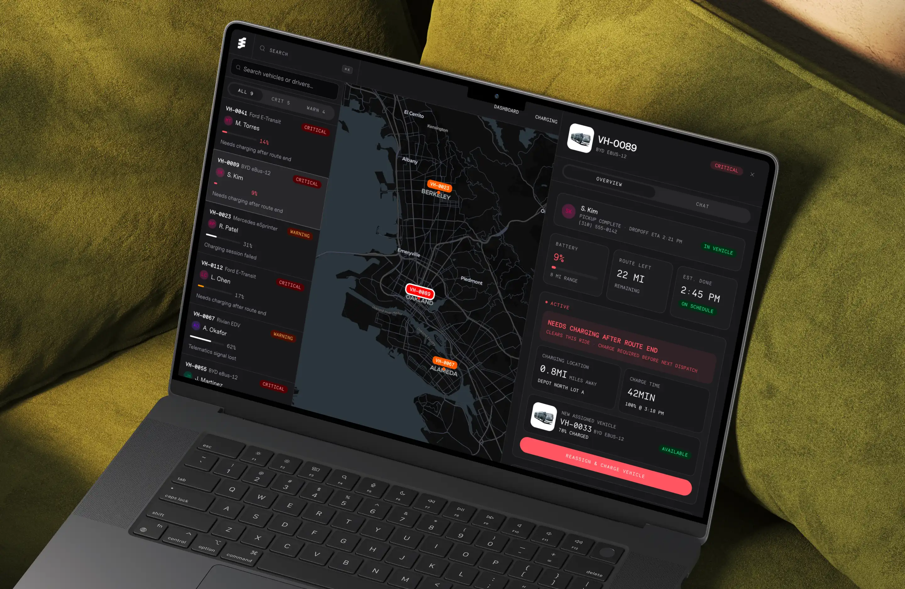
Ops-heavy SaaS products accumulate complexity fast. A fleet dashboard starts with vehicle status. Then someone adds charging windows. Then battery levels, driver assignments, route progress, alerts.
Each addition made sense in isolation. But nobody stepped back to ask: what does a dispatcher actually need to see first?
The result is a product that works, but doesn't communicate. Everything is on screen. Nothing is prioritized. And when you demo that product, the confusion in the room isn't about your pitch. It's about the interface.
What Most Teams Do Wrong
They treat the demo as a sales problem. They hire a sales consultant, tighten the script, and try to narrate their way through a confusing UI. It never works for long.
They lead with features. A dispatcher doesn't care that you have real-time telemetry. They care whether they can see which vehicles need attention without digging through five panels to find out.
They demo the full product. Showing everything is the fastest way to overwhelm a prospect. A demo should show one workflow, done clearly. That's it.
They skip the "why this matters" moment. A good demo makes the outcome felt, not just seen. If your product saves dispatchers 40 minutes per shift, the demo should make that feel real, not just state it.
What a Logistics or Fleet SaaS Demo Should Actually Show
A product demo is not a tour. It is a decision support tool.
Your prospect is asking one question the entire time: "Can I trust that this product will solve my problem without creating new ones?"
If your UI answers that question clearly, the demo almost writes itself. If it doesn't, no amount of scripting or editing will fix it.
The demo is a mirror. It shows exactly how clear (or unclear) your product actually is.
Practical Breakdown
Before working on the demo itself, work on the product's communication structure:
1. Define the primary workflow What is the one thing your user does most often? Build the demo entirely around that. Everything else is secondary context.
2. Apply a strict information hierarchy What does the user need to see first, second, third? That hierarchy should be visible in the UI before a word is spoken.
3. Surface the three core questions your user has For a fleet manager: Which vehicles are active? Which are charging? Which need attention? Design the interface around those questions. Demo the interface, not the features.
4. Cut anything that requires explanation If you find yourself saying "this part is a bit complex but..." during a demo, that's a UX problem. Fix the UI. Don't narrate around it.
5. Design the demo path before you record or present Walk through the product and mark the three moments where value lands. Build toward those moments. Cut everything that doesn't serve them.
Before vs. After: Common Demo Mistakes
What Most Teams Do | What Actually Works |
|---|---|
Demo the full product | Demo one complete workflow |
Lead with features | Lead with the user's problem |
Explain complexity verbally | Remove complexity from the UI first |
45-minute discovery calls | 5-minute async demo that pre-qualifies |
Generic dashboard screenshot | Prioritized view built around real operator needs |
The Real Fix
If your demo isn't converting, resist the urge to recut the video or rewrite the script.
Instead: look at the product. Find the moment where a new user gets lost. Find the panel that shows too many things at once. Find the workflow that requires three clicks when it should require one.
Fix that. Then demo it.
Ops-heavy products are genuinely complex. But complexity in the system doesn't have to mean complexity in the interface. That's the job of product design: to absorb the complexity so the user doesn't have to carry it.
When your product does that well, the demo becomes easy. The prospect sees it, understands it immediately, and asks when they can start.
If your product is hard to demo because it's hard to use, that's a design problem worth solving. I work with founders of ops-heavy SaaS products to restructure dashboards and workflows so the product sells itself. Book a 15-minute call to talk through what that looks like for your product.